About Perception 知覚について
This is an article to introduce various topics in Sketching with Code, illustrating the relationships between them and adding more context to provide a sort of overview. The articles are not in order of difficulty. Please just jump to whichever one interests you.
これは Sketching with Math and Quasi Physics 上の様々なトピックについて、それぞれの間の関係や概要を示したり、新たな文脈を加えたりするためのページです。難易度順には並んでいないので、興味のある記事から自由に読んでみてください。
Human perception has evolved over a long time to give us useful information about the world. But what we perceive is only a little sliver of what’s actually out there. For example, light, or electromagnetic waves more broadly, spans a vast range of frequencies, but we can only see a small part of that spectrum. The reason we probably settled on this specific range is that it was good enough to detect and distinguish everyday objects, plants, and animals, helping us survive and navigate our environment.
人間の知覚は長い進化の過程を経て、私たちに世界についての有用な情報を与えてくれるようになりました。しかし、私たちが知覚できるものは、実際に存在するもののほんの一部にすぎません。たとえば、光、より広い意味では電磁波はとても広い周波数帯にわたって存在していますが、目に見えるのはそのスペクトルのわずかな部分だけです。人間の視覚がこの特定の範囲に落ち着いたのは、日常的に物や植物、動物などを見分けて、生存と環境での活動に役立つのに十分だったからでしょう。
Another reason is more physical: many parts of the electromagnetic spectrum, like X-rays or gamma rays, tend to pass through objects or scatter unpredictably. That makes it difficult, if not impossible, for animals to evolve organs that can capture them.
もう1つの理由はもっと物理的です。X線やガンマ線のような電磁スペクトルの多くの部分は、物体を通り抜けたり予測不可能に散乱したりするため、動物がそれらを捉えることのできる器官を進化させることは、難しいか不可能だったのです。
The way we perceive different physical phenomena doesn’t always match their actual physical nature. Light and sound are both waves, but we almost never experience them as vibrations (except for very low-frequency sounds). In both cases, frequency affects what we perceive, but in very different ways. Sound frequencies are perceived as pitch, and we describe them as “high” or “low.” On the other hand, different frequencies of light appear to us as different hues of colors without any sense of high or low frequency.
私たちが様々な物理現象を感じるあり方は、実際の物理的な性質とは必ずしも一致しません。光も音も波ですが、(非常に低周波の音を除いて)それらを振動として感じることはめったにありません。どちらの場合も周波数は知覚に影響を与えますが、その方法は大きく異なります。音の周波数は音程として知覚され、「高い」「低い」と表現される一方、光の周波数は高低ではなく、異なる色相として認識されます。
Studying perception is fascinating because every person’s experience of the world is different. No one else sees exactly the same colors you see. Your perception exists only within you and doesn’t exist without you. For this reason, the study of perception can’t be purely objective. We have to ask people how they feel. In fact, the color models we use today are based on data collected from many people comparing colors and describing how similar or different they appear.
知覚について研究するのが面白いのは、私たち1人1人の世界の体験が異なるためです。他の誰も、あなたと全く同じ色を見ているわけではありません。あなたの知覚はあなたの中にのみ存在し、あなたなしには存在し得ません。そのため、知覚の研究を純粋に客観的に行うことはできません。人々の感じ方を直接尋ねる必要があるのです。実際、現在使用されている色のモデルは、多くの人々が色を比較し、それらの類似性や違いを説明したデータに基づいて作られています。
Some people may extend this to say the world doesn’t exist without you, or it is impossible to understand someone else. Let’s not go there yet.
中には「あなたなしには世界は存在しない」とか「他人を理解することは不可能だ」といった議論に発展させる人もいるかもしれませんが、そこまでは踏み込まないでおきましょう。
Colors
色
How we perceive and use color is shaped by many different factors.
色を知覚したり使う方法は、様々な要因によって形作られています。
First, our biology. As we touched upon earlier, we perceive different light frequencies as different hues, not as a one-dimensional gradient from red to violet, but arranged in a circle. This is because we perceive colors based on the balance between three receptors (cones) for different ranges of frequencies, each roughly corresponding to red, green, and blue. The actual light is a mixture of different frequencies. If a light contains more blue and red but less green, we perceive it as purple, a color that doesn’t actually exist in the spectrum itself — below red is infrared, and above violet is ultraviolet. This reminds us that color might be more about what’s happening inside us than something intrinsic to the light itself.
まず、生物学的な要因があります。先ほど触れたように、私たちは異なる光の周波数を異なる色相として知覚しますが、それは赤から紫までの一次元的な階調ではなく、円環状に配置されて認識されます。これは、私たちが赤、緑、青にそれぞれ対応する3つの受容体(錐体)のバランスに基づいて色を知覚しているためです。実際の光は様々な周波数の混合物です。青と赤の成分が多く、緑の成分が少ない光は紫として知覚されますが、この紫は実際のスペクトル自体には存在しない色で、赤より下の周波数は赤外線、紫より上は紫外線になります。こう考えると色とは光そのものの本質的な性質というよりも、私たちの内部で起きている現象かもしれないと思い至ります。
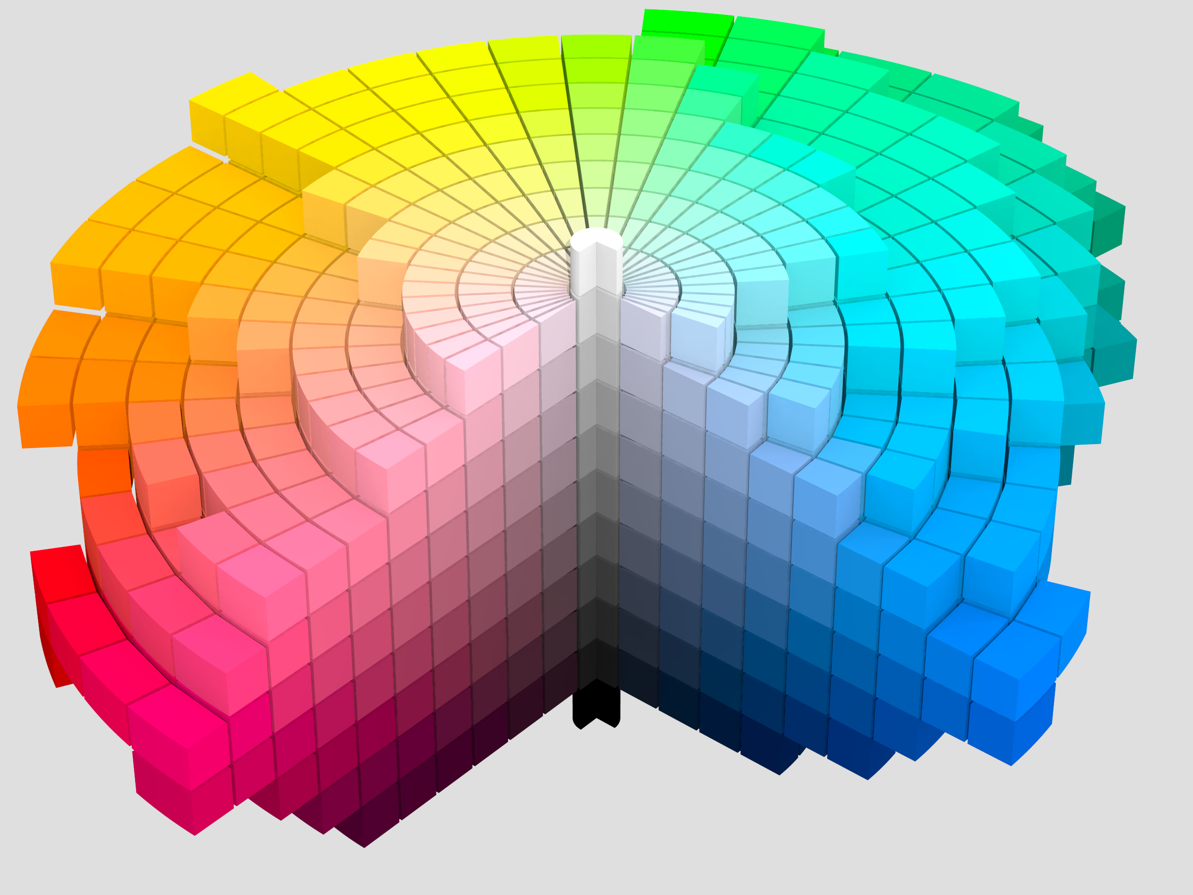
https://commons.wikimedia.org/wiki/File:Munsell_1943_color_solid_cylindrical_coordinates_gray.png
Colors are also cultural and social. Despite not knowing exactly what other people are seeing, we tend to generally agree on how we see colors. We can think of this in terms of semantics, such as red or yellow-and-black stripes for danger, to feelings and aesthetics like “blue feels cool” and “green is relaxing,” to what feels pleasing versus jarring. These associations likely started from nature, where certain objects and phenomena have specific frequencies, and then were influenced by cultural aspects, as certain colors are used repeatedly in specific ways to reinforce our associations. For example, unripe fruits are usually green, and they turn yellow, orange, or red when they are ready to eat, and we’ve been reinforcing these associations by using these warm colors on food packages, signboards, etc.
色には文化的・社会的な側面もあります。他人が実際に何を見ているのか正確にはわからないにもかかわらず、私たちは色の見方についてある程度共通の認識を持っています。これは、危険を表す赤色や黄黒の縞模様といった意味的な側面から、「青は涼しい」「緑は落ち着く」といった感覚的だったり美醜に関わる印象まで及びます。こうしたつながりはおそらく自然の中で、特定の物体や現象が持つ周波数から始まったのでしょう。その後、色が特定の文脈で繰り返し使用されることで文化的な影響を受け、つながりはより強化されていきました。例えば、未熟な果実は通常緑色で、食べ頃になると黄色やオレンジ、赤色に変化します。この連想は、食品パッケージや看板などで繰り返し用いられることでさらに強化されます。
Our view on colors has also been significantly influenced and constrained by our tools. People have been working hard to reproduce and create various colors—from using plant-based dyes, to making expensive gemstones into paints, chemical and synthetic compounds, to analog and digital displays, and even nanotechnologies to create structural colors (such as iridescence). As colors became more available, they got more involved in our culture and even economies, creating trend cycles of colors to drive consumption.
色に対する私たちの見方は、道具によっても大きく影響を受け、また制限されてきました。人々は様々な色を再現したり作り出したりするために懸命に努力してきました。植物を元にした染料、高価な宝石から作られた顔料、化学物質や合成化合物の開発、アナログやデジタルディスプレイの発展、そして構造色(貝殻や昆虫などに見られる、物理構造によって色が変わって見える現象)を生み出すナノテクノロジーまで。色がより身近になるにつれ、それらは文化や経済に深く組み込まれ、消費を促す色のトレンドサイクルを生み出すようになりました。
The fact that people don’t see colors in the same way cannot be emphasized enough. It is estimated that there are approximately 300 million people in the world with color vision deficiency. I’d even hesitate to call it a ‘deficiency’—it’s really just a different way of seeing.
人々が色を同じように見ていないという事実は、いくら強調しても足りません。推定では世界中で約3億人が色覚障がいを持っているとされています。これは障がいというよりはそれは単に異なる見え方といった方が良いでしょう。
We often use charts like the one below to simulate different perceptions (the demo is emulating deuteranopia). This probably does a good job of illustrating where people may have difficulty distinguishing colors, but this is not representing the world they’re seeing. It’s not true to say the world appears mostly yellow and blue to people with deuteranopia.
異なる色覚を持つ人々の知覚をシミュレートするために下のような図がよく使われます(このデモは第二色覚特性をエミュレートしています)。これは色の区別が難しい部分を説明するのには良い方法かもしれませんが、実際に彼らが見ている世界を表現しているわけではありません。第二色覚特性を持つ人々の世界が主に黄色と青だけでできているわけではないでしょう。
Representing someone’s vision for someone else is impossible, but at least understanding how we see colors and how to manipulate them systematically can help us imagine and approach this challenging and fascinating problem.
他人の視覚体験を完全に再現することは不可能ですが、私たちが色をどのように知覚し、それらを体系的に扱えるかを理解することは、この困難かつ魅力的な問題について想像したり、アプローチを考える助けになるでしょう。
All of this shows that color perception is a complex mix of physical phenomena, evolutionary quirks, instinct, culture, and tools from pigments to pixels. And all of it is, in a way, somewhat arbitrary. It’s just the way the world and we humans happened to turn out. Depending on the angle you look from, you can describe color in many different ways. That’s why we have so many color systems and models.
これら全ては、色の知覚が、物理的な現象、進化の過程で生まれた特徴、本能、文化、そして顔料からピクセルに至るまでの様々な道具が複雑に組み合わさったものだと示しています。そして、ある意味でこれらはすべて偶然の産物といえます。世界と人類がたまたまこのような形に落ち着いただけなのです。見方によって、色は様々な方法で説明することができ、そのため数多くの色彩体系やモデルが存在します。
We are only scratching the surface of this topic in Colors and Numbers 色と数値, but there are tons more that we can discuss. I recommend the following book for the history of color theories and their use.
この話題についてはColors and Numbers 色と数値でごく表面的に触れましたが、まだまだ議論できることがたくさんあります。色彩理論の歴史と理論がどう使われてきたかについては、以下の本を強くお勧めします。


Sound
音
Sound is also a wave. Unlike color, we can actually feel its frequency more directly, though we don’t always notice it as physical vibration. Lower frequencies feel “low,” and higher frequencies feel “high.” This height of sound is called pitch.
音も波です。色とは異なり音の場合は、物理的な振動として常に意識するわけではないにせよ周波数をより直接的に感じることができます。低い周波数は「低く」、高い周波数は「高く」感じられ、この音の高さのことを音高と呼びます。
Interestingly, we don’t experience pitch as just a straight line—it feels more like a spiral. For example, if you start at 440 Hz (the A note) and go up, you’ll eventually hit another A at 880 Hz at exactly double the frequency. It’s not the same sound, but we hear it as the same note, just in a higher octave.
面白いことに、私たちは音高を単純な直線としてではなく、螺旋のように感じます。例えば、440 Hz(A音)から上に向かうと、周波数がちょうど2倍の880 Hzで別のA音に到達します。これは違う音でありながら、私たちの耳には1オクターブ上がっただけの同じ音として認識されるのです。
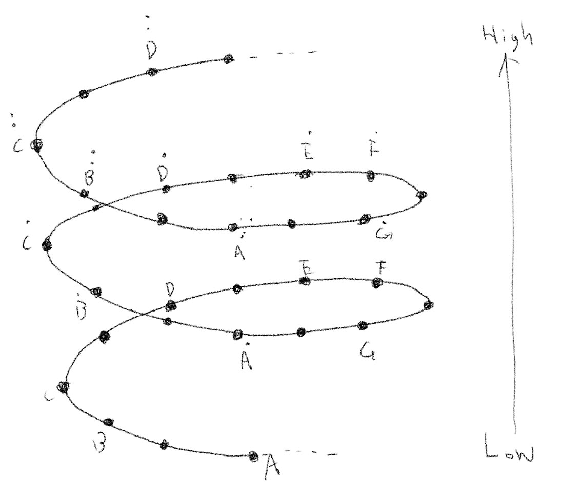
Western music typically divides the octave into 12 pitches, each spaced evenly in terms of frequency ratio. Other musical cultures divide the octave differently. Some use more notes, some fewer, but the concept of the octave itself shows up pretty much everywhere.
西洋音楽では一般的にオクターブを12の音程に分割し、それぞれの音程は周波数の比が均等になるように配置されています。他の音楽文化ではオクターブの分割方法が異なり、より多くの音程を使うものも、少ない音程を使うものもありますが、オクターブという概念自体はほぼすべての文化圏に見られます。
Not just pitch, we can also tell sounds apart based on their timbre, which is like the texture or color of a sound. That’s how you can tell apart different sounds, like a bird chirping, car horns, or instruments like piano and trumpet. In Japanese, timbre is called 音色 (on-shoku), which literally means “sound color.”
音の高さだけでなく、音色、つまり音の質感や色合いのようなものによっても音を区別することができます。これによって、鳥のさえずり、車のクラクション、ピアノやトランペットといった楽器など、異なる音を聞き分けることができます。日本語ではまさに音の色と呼ばれる通りです。
Both pitch and timbre are tied to the physical characteristics of the thing that’s making the sound.
音の高さと音色は、音を発するものの物理的な性質と密接に結びついています。
Let’s take a guitar string as an example. The pitch depends on its length and weight. The longer or heavier the string, the lower the pitch. But the sound a string makes isn’t just one pure frequency. When you pluck it, the string vibrates in many ways at once. The main pitch is called the fundamental frequency, but parts of the string also vibrate in smaller sections—halves, thirds, quarters, etc. These create harmonics or overtones, which are simple multiples of the base frequency.
ギターの弦を例に取りましょう。音の高さは弦の長さと重さによって決まります。弦が長いほど、また重いほど、音は低くなりますが、弦が出す音は1つの周波数だけではありません。弾かれると弦は一度に様々な形の振動を生み出します。基本となる音の高さは基本周波数と呼ばれますが、弦の各部分も小さな区分(半分、3分の1、4分の1など)で振動していて、基本周波数の単純な倍数に当たる倍音や上音と呼ばれる音を鳴らします。
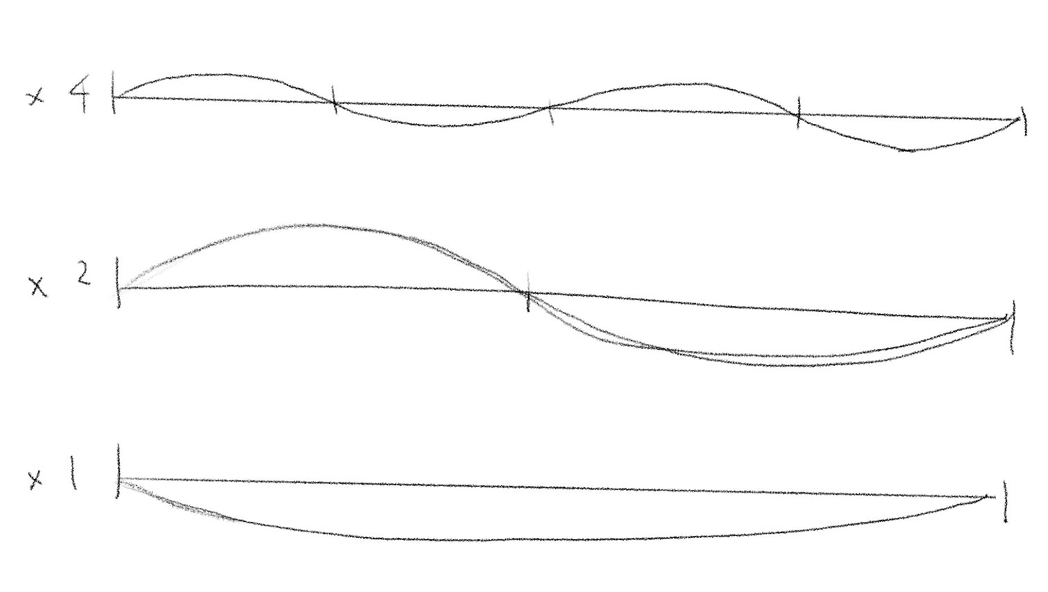
When you pluck on a string, the string vibrate with multiple frequencies mixed at the same time. 弦を弾くと、複数の周波数が同時に混ざり合って振動します
This happens with any object, though the mix of frequencies might be a lot messier. Just like colors are usually a blend of frequencies, sounds are too. But unlike color, where a certain frequency always looks like the same hue (e.g., 440 THz light always looks red), sound doesn’t work that way. A guitar sounds like a guitar no matter what note it plays, because its timbre comes from the relationship between the overtones, not the absolute frequencies themselves. That’s why we can tell a violin from a flute, or recognize someone’s voice, or know what kind of object made a noise, based on how that sound’s overtones are structured regardless of the frequency. You can sing a high note or low note, and you will still sound like you.
これはどの物体でも起こりますが、周波数の混ざり方はもっとグチャグチャかもしれません。色が大抵様々な周波数の組み合わせであるように、音も同じです。ただし、色の場合は特定の周波数が常に同じ色相として見える(例えば440 THzの光は常に赤く見える)のに対し、音はそうではありません。ギターは演奏する音の高さが変わっても、常にギターらしい音色がします。これは音色が絶対的な周波数ではなく、倍音同士の関係によるものだからです。音の倍音の構造によって、周波数に関係なくバイオリンとフルートを聞き分けたり、誰かの声を認識したり、どんな物体が音を出したのかを知ることができるのです。高い音で歌っても低い音で歌っても、あなたの声はあなたらしく聞こえるでしょう。
It is interesting to think about this from an evolutionary standpoint. Our hearing has evolved to react to frequency ratios probably because that was useful in identifying different sources, people, animals, objects, etc. This sensitivity also lets us enjoy the different tones of sound and the relationships between different pitches of sound, which is known as harmony in music.
これを進化の面から考えるのも面白いでしょう。私たちの聴覚は、異なる音源、人、動物、物体などを識別する必要性から、周波数の比に反応するように進化したと考えられます。この感受性のおかげで、私たちは様々な音色や音程の関係性、つまり、音楽におけるハーモニーを楽しむこともできるようになりました。
Understanding wave properties helps us better comprehend the relationship between physical vibrations and the sounds that we hear, and sketch ideas playing around with and visualizing sound.
波の性質を理解することで、物理的な振動と私たちが聞く音との関係をより深く理解し、音を使って遊んだり視覚化するなど、アイデアのスケッチができます。
Sine waves and Additive Synthesis サイン波と加算合成
Magnitude and Logarithm
大きさと対数
Something that I think is understated, but has been a very useful insight for sketching and designing things, is that the relationship between physical quantities and their impact on human perception is logarithmic in many cases.
あまり触れられることがありませんが、スケッチしたり何かをデザインするときにとても役立つ考え方に、物理的な量とそれが人間の知覚に与える影響の大きさの関係は、多くの場合、対数的であるということがあります。
For example, the strength of the light we feel depends on the number of photons our eyes catch. But twice the photons doesn’t mean it feels twice as bright. Physically, a sunny day outdoors can have 200 times more light than a well-lit office. But does it feel 200 times brighter? Probably not.
例えば、私たちが感じる光の強さは、目が捉える光子の数によって決まります。しかし、光子の数が2倍になっても、私たちが感じる明るさは2倍にはなりません。晴れた日の屋外の光はよく照明された室内に対して物理的には200倍もの光量がありますが、実際に200倍も明るく感じたりはしないでしょう。
The same goes for sound. Loudness is related to the energy of the sound, which is directly related to the amplitude of the sound wave. But again, the relationship to the way we feel is not direct. A subway might have 100 times more sound energy than someone talking, but it doesn’t feel 100 times louder.
音も同様です。音の大きさは音のエネルギーに関係しており、それは音波の振幅に比例しています。ここでも私たちの感覚との関係は直接的ではありません。地下鉄の騒音は人の会話の100倍ものエネルギーを持っているかもしれませんが、100倍も大きく感じるわけではありません。
This can be seen in a couple of ways. Life had to survive across wildly different conditions, like daylight and moonlight. So our perception systems likely evolved to compress all that information into a manageable scale. The other way to look at it is that when numbers are huge, small changes matter less. Imagine you’re stuck in traffic — a 10-minute delay feels huge when your trip is only 15 minutes, but it doesn’t matter as much if you’re going for a 5-hour drive. Similarly, adding a candle doesn’t help much when you’re already under the sun, while it can make a huge difference when you’re in a cave.
これには2つの観点から考えることができます。生命は昼の光から月明かりまで、大きく異なる環境下で生存する必要がありました。そのため、私たちの知覚システムは、これらの多様な情報を扱いやすい規模に圧縮するように進化したと考えられます。また別の見方をすると、数値が大きくなるほど、小さな変化の重要性は相対的に低下します。渋滞を思い浮かべてみましょう。10分の遅れは目的地が15分先であればおおごとに感じますが、5時間のドライブではさほど気になりません。同じように、明るい太陽の下ではろうそくの光を足してもほとんど効果がありませんが、暗い洞窟の中では大きな違いをもたらすのです。
Physical values and human perception 物理的な値と人間の知覚
Humans could have evolved more sensitive eyes like cats to see in darkness, but we haven’t. Perhaps our ancestors were not as nocturnal as cats, or they weren’t nocturnal because they didn’t have cats’ eyes. Either way, we managed to survive.
人間が猫のような暗闇で見える鋭敏な目を進化させることもありえたはずですが、そうはなりませんでした。おそらく私たちの祖先は猫ほど夜行性ではなかったか、あるいは猫のような目を持っていなかったために夜行性にならなかったのでしょう。それでも、人は十分に生き残ることができました。
There is an important nuance here. Life doesn’t evolve with purpose. A statement like “giraffes acquired long necks in order to eat leaves high up” is misleading. The reality is more like something random happened to the genes, and that change happened to give the genes themselves a better chance to be passed on to following generations.
ここには重要なニュアンスがあります。生命は目的を持って進化するわけではありません。「キリンは高い葉を食べるために長い首を獲得した」という表現は誤解を招きます。実際には、遺伝子に何かランダムな変異が生じ、その変化がたまたま、その遺伝子が次世代に引き継がれる可能性を増やしたというのが真相に近いのです。
Resolution
解像度
This taps into another important topic. Resolution is how detailed something can be represented or perceived.
これは別の重要なトピックにつながります。解像度とは、物事がどれだけ詳細に表現または認識できるかということです。
There is a certain limit to our senses regarding how small a difference we can detect, or how finely we can distinguish things from one another, and various technologies actively exploit these limitations to deliver experiences.
私たちの感覚には、どの程度の小さな違いを検知できるか、またものごとをどれだけ細かく区別できるかという限界があります。様々な技術は、これらの知覚の限界を効果的に活用して、さまざまな体験を生み出しているのです。
For example, computer displays are made of small dots. But when these dots are small enough — somewhere around 300 DPI(dot per inch) at reading distance, or a viewing angle of 1 arcminute (1/60 degree) — our eyes and brain stop seeing the dots and start to see images and characters. Movies have only 24 frames per second, but that’s enough to make us believe they are smooth and real. The majority of digital audio uses 44,100 samples per second, which means a second of sound is represented by 44,100 numbers. This rate was selected because it is enough to reproduce sound up to 20,000 Hz, which is about the upper limit of pitch that humans can hear. If humans had different capabilities, these technologies could have been designed differently.
例えば、コンピューターのディスプレイは小さな点で構成されています。これらの点が本を読むくらいの距離で約300 DPI(dot per inch)、つまり視角1分(1/60度)程度に十分に小さくなると、人間の目と脳は個々の点を認識するのをやめ、それらを画像や文字として捉えるようになります。映画は1秒あたりわずか24フレームですが、それでも私たちには滑らかで現実的に見えます。デジタル音声の多くは1秒の音を44,100個のサンプル、つまり、44,100個の数値で表現します。この値が選ばれたのは、人間の可聴域の上限である20,000 Hzまでの音を再現するのに十分だからです。もし人間の知覚能力が異なっていたら、これらの技術も違う形で設計されていたことでしょう。
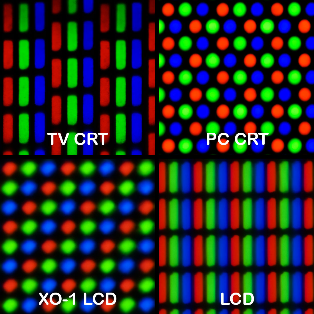
Geometry of color elements of various CRT and LCD displays - Wikimedia
An interesting part is even when there isn’t enough resolution, our brain often try to see continuity by complementing the missing details. Early monitors were much more coarse and the pixels were far more visible. But people were accepting the quality, and there is even appreciation and nostalgia for the low resolution graphics aka 8-bit style.
興味深いことに十分な解像度がなくても、人の脳は欠けている詳細を補完して連続性を見出そうとします。初期のモニターは非常に粗く、ピクセルが目立っていましたが、人々はその画質を受け入れていたし、8ビットスタイルと呼ばれる低解像度のグラフィックに愛着や懐かしさを感じさえもします。
Animations, especially cartoonish ones, can utilize a lower frame rate to add unique effects. Sometimes, letting the brain fill in the gaps is better than trying to draw everything in detail and having the illusion fall apart by having discrepancies here and there.
アニメーション、特にカートゥーン風のものでは、低いフレームレートを活用して独特の効果を出すことができます。時として、細部まで全てを描き込もうとして不自然さが目立ってしまうよりも、脳に隙間を補完させる方が効果的なのです。
Embracing the differences and complexity
違いと複雑さを受け入れる
When we sketch with code, we are always engaging with how humans perceive things. Our senses are full of quirks. They compress, filter, and interpret the raw physical world in different ways to make sense of it. Understanding how human perception works helps us see things and make things from different perspectives. It feels fascinating and freeing that when it comes to human perception, there’s no one right model, just many ways to look at things. Embrace the differences and complexity, and have fun.
コードでスケッチをするとき、私たちは常に人間がものをどのように知覚するかということと向き合っています。私たちの感覚は奇妙なあり方に満ちています。感覚は物理的な世界の生データを圧縮し、フィルタリングし、さまざまな方法で解釈して意味を見出します。人間の知覚の仕組みを理解することは、物事を異なる視点から見たり作ったりする助けとなります。人間の知覚に関して、唯一の正しいモデルは存在せず、物事を見る多くの方法があるという事実は、とても魅力的で解放的です。違いと複雑さを受け入れ、楽しみましょう。