Physical values and human perception 物理的な値と人間の知覚
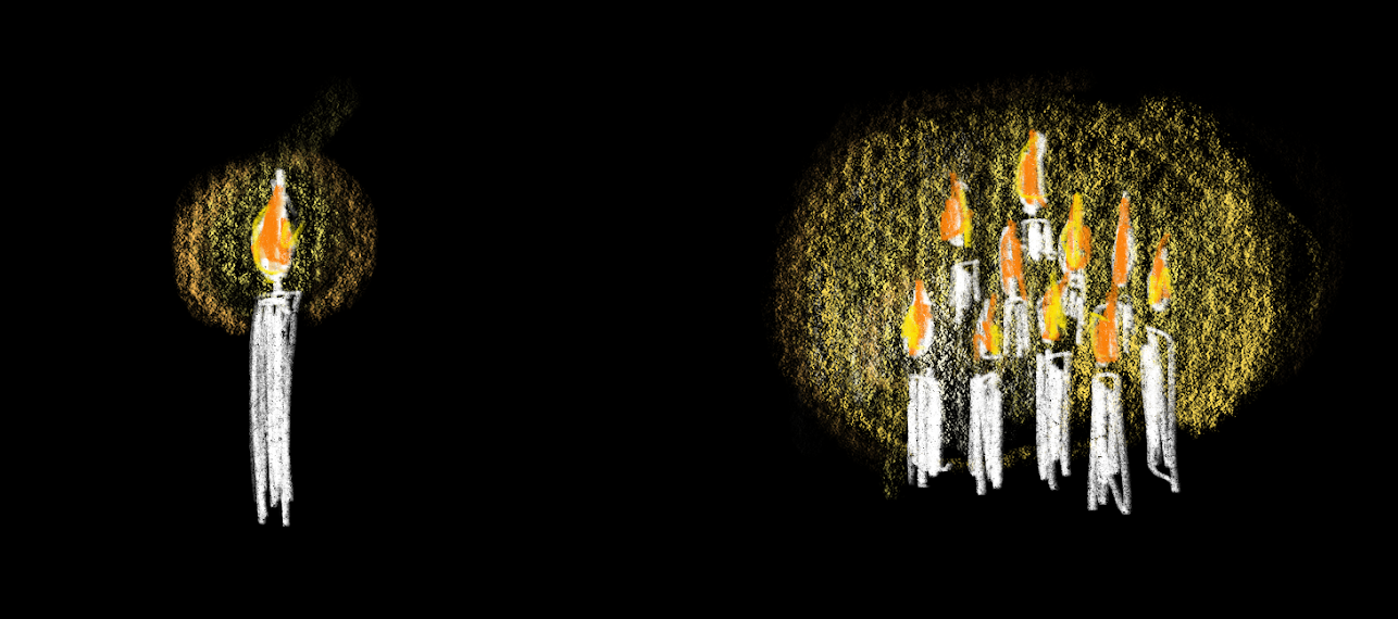
In a dark room, lighting a single candle may feel like a drastic change. But in a room already lit by ten candles, adding one more might not feel as significant. Or, while the intensity of sound is determined by the amplitude of the sound wave, doubling the amplitude does not make it feel twice as loud to humans.
暗い部屋で、1本のろうそくを灯すと劇的な変化を感じるかもしれませんが、既に10本のろうそくで明るい部屋に、さらに1本追加してもさほど違いを感じないかもしれません。音の強度は音波の振幅で決まりますが、振幅を倍にしても人間にとっては2倍の音量に感じられるわけではありません。
There is a theory called “Weber-Fechner law” that describes this relationship between the intensity of a physical phenomenon and the perception of that stimulus. Basically, what it says is that the change in the intensity of something as perceived by humans is not directly proportional to the actual change in the intensity of the underlying phenomenon.
「ウェーバー・フェヒナーの法則」と呼ばれる、物理現象の強度と、その刺激の知覚との関係を説明する理論があります。この法則は基本的に、人間が知覚するものの強度の変化は、元になる実際の現象の強度の変化と比例しないと述べています。
The exact theory is not too important here, but this pattern is commonly seen across different areas where there is a relationship between numerical representations of a phenomenon and human perception. It is actually useful to keep this in mind when sketching things with code because it often involves designing the audience’s experience by choosing some appropriate numbers. Also, logarithm, which I thought would be totally irrelevant in high school, becomes very handy here. Let’s look at some examples.
正確な理論はここではあまり重要でないのですが、このパターンは、ある現象を数値で表わしたものと人間の知覚の関係について、さまざまな領域でよく見られます。コードで何かをスケッチする際には、鑑賞する人の体験をデザインするために適切な良い数値を選ぶ必要があるので、このパターンを覚えておくことは実際に便利です。また、高校の時には人生に関係ないと思えた対数も、ここではとても役立ちます。いくつかの例を見てみましょう。
Sound perception
音の知覚
Sound is a wave, and as we have already mentioned, its intensity is defined by the amplitude. The amplitude represents the maximum displacement of air (or any other medium through which the sound travels) caused by the sound wave. The greater the amplitude, the greater the energy and the stronger the sound.
音は波です。すでに述べた通り、音の強さはその振幅によって定義されます。振幅は音波によって引き起こされる空気(または音が伝わる他の媒体)の最大変位を表し、振幅が大きければ大きいほど、エネルギーも強く音も大きくなります。
But the relationship between the amplitude and our perception of loudness is not linear. A small change in intensity at high levels might not be as noticeable as the same change at lower levels, and the perceived loudness does not increase at the same rate as the increase in amplitude.
ですが、振幅と人間による音の大きさの認識の関係は線形ではありません。大きな音に対する強度のわずかな変化は、小さな音に対する同じ量の変化ほど目立たず、知覚される音の大きさは振幅の増加と同じペースでは増加しません。
Decibels (dB) and Logarithmic Scale
デシベル(dB)と対数スケール
We can hear a wide range of sounds, varying from very quiet to very loud. Here are some examples of these sounds and their energy levels:
-
A whisper: approximately (watts per square meter)
-
A normal speaking voice: approximately
-
The noise in a subway: approximately
私たちはとても小さな音から大きな音まで、幅広い音を聞くことができます。下記はいくつかの音とその音が持つエネルギーの例です。
-
ささやき声:約 (ワット毎平方メートル)
-
通常の話し声:約
-
地下鉄内の騒音:約
But does a subway feel 100 times as loud as someone speaking, or 100,000 times louder than a whisper? Perhaps you can agree that these numbers feel a bit excessive. Additionally, dealing with large numbers can be challenging in general. If you plot this on a line, it will look like this.
しかし、地下鉄の騒音は、話し声より100倍やささやきよりも100,000倍も大きい音に感じられるでしょうか。おそらくこの数字はちょっと過剰に思えるでしょう。また、一般的にも大きな数値を扱うのは厄介です。これを線上にプロットすると、次のようになります。
The whisper and the speaking voice are too close, and the subway noise is far away. This doesn’t match with our intuition.
ささやき声と普通の声が近すぎて、地下鉄の騒音はずっと遠くにあります。これは直感と合いません。
Decibel (dB) is the most common unit used to measure the loudness of sound, and it is designed with human perception in mind.
Decibel (dB)は、音の大きさの測定に使われる最も一般的な単位で、人間の知覚を考慮して設計されています。
The decibel uses a logarithmic scale to compare the intensity of a sound to a reference intensity. The sound level in dB is defined as . Here, represents the physical intensity of the sound in question, and represents the reference intensity, which is usually the threshold of human hearing, approximately watts per square meter. This means that:
-
A whisper: approximately 30 dB
-
A normal speaking voice: approximately 60 dB
-
Subway noise: approximately 80 dB
デシベルは、音の強度を基準となる強度と比較するために対数を使います。dBで表される音のレベルは、 と定義されます。ここで、 は対象の音の物理的な強度を表し、 は通常、人間の聴覚の閾値であるおおよそ ワット毎平方メートルを表します。この単位を使うと下記のようになります。
-
ささやき:約30 dB
-
通常の話し声:約60 dB
-
地下鉄内の騒音:約80 dB
Doesn’t this graph look more reasonable? The x-axis is and the y-axis is dB.
下のグラフはより妥当に見えないでしょうか。X軸は で、Y軸はdBです。
Note that it’s not that human perception strictly follows a logarithmic scale. Quantifying human perception is not that simple, and there isn’t a perfect solution. The logarithmic scale is chosen mostly for convenience, because it appears to better represent human intuition and is mathematically simple and manageable. But as long as you keep that in mind, logarithm is a great tool that can be applied to many other things, as we will see in other examples.
人間の知覚が、厳密に対数的な尺度に従うわけではないことに注意してください。人間の知覚を定量化することはそれほど単純ではなく、完璧な方法はありません。対数は、人間の直感をより適切に表現し、数学的にも単純で扱いやすいという理由で、主に利便性のために選ばれたものです。ですが、そのことを念頭に置いている限り、対数は他の多くのことにも適用できる便利な道具です。他の例でも見ていきましょう。
The pitch and frequency have a similar exponential/logarithmic relationship. The frequency increases by a factor of for each half step. Or, the number of half steps can be expressed as a logarithm or the ratio between frequencies with a base of . Please refer to the Pitch and Frequency page.
音の高さと周波数も、半音ごとに周波数が 倍になる、周波数の比を を底とする対数で表すと半音の数になる、という指数関数/対数的関係にあります。音高と周波数のページを参照してください。
Light and brightness
光と明るさ
While there isn’t a unit like dB that uses a logarithmic scale, the same approach can be used to represent a wide range of values for light intensity more intuitively.
dBのような対数を用いる単位は存在しませんが、同じアプローチを使って、広い範囲にわたる光の強度の値を直感的に表現できます。
Environment illuminance
環境の照度
Lux is a unit of illuminance, measuring the amount of light that falls on a surface. Unlike dB, it is a linear measurement of the amount of light.
-
A night lit with moonlight can be around 0.3 lux at maximum, which is enough to see general shapes but not for details.
-
A well-lit office where people can see everything clearly can be 500 lux.
-
An overcast day can be around 1,000 lux.
-
A bright sunny day can have around 100,000 lux.
ルクスは、表面に当たる光の量を測定する照度の単位です。dBと違いこれは光の量の線形な単位です。
-
月明かりで照らされた夜は、最大でも0.3ルクス程度です。大まかな物の形は見えますが、詳細は見えません。
-
明るく照らされたオフィスは500ルクス程度で、すべての物をはっきりと見ることができます。
-
曇りの日は、おおよそ1,000ルクスです。
-
晴れた日は、約100,000ルクスの明るさがあります。
It is amazing that human eyes are so adaptive to a vast range of brightness. But again, does the sunny outside feel 200 times brighter than an office, or 100 times than a cloudy day? Writing these as powers of ten can make it a little more intuitive.
-
Moonlight: lux
-
A well-lit office: lux
-
An overcast day : lux
-
A bright sunny day: lux
人間の目が非常に広い範囲の明るさに適応できるのは素晴らしいことです。しかし音の件と同様ですが、晴れた日は、オフィスよりも200倍、曇った日よりも100倍明るく感じるでしょうか。これを10のべき乗で表すと、もう少し直感的になります。
-
月明かり: ルクス
-
明るいオフィス: ルクス
-
曇りの日: ルクス
-
晴れた日: ルクス
Gamma Correction
ガンマ補正
Gamma correction is another example of the application of this principle. The brightness of a screen pixel that humans perceive is not linear to the physical value that the device handles, such as the voltage applied to the pixel. Gamma correction is applied to compensate for this gap and alter the relationship between the numerical RGB values and the actual brightness perceived by our eyes. This correction, defined for the sRGB standard, can be approximated as follows (see here for more accurate formulas):
ガンマ補正は、この原則の応用の別の例です。人間が知覚する画面のピクセルの明るさは、ピクセルに適用される電圧など、デバイスが扱う物理的な値とは線形な関係にありません。ガンマ補正は、このギャップを補償し、数値的なRGB値と人間の目が知覚する実際の明るさとの関係を修正するために適用されます。sRGB標準で定義されたこの補正は以下のように近似されます(より正確な数式についてはこちらを参照してください):
Usually this kind of corrections is already set by manufacturers, but you might want to consider a similar approach when you are dealing with custom hardware, for example, controlling LEDs with code.
この手の補正は普通メーカーによって既に設定されている物ですが、たとえばコードでLEDを制御するなど、カスタムのハードウェアを扱う場合には同様のアプローチを検討すると良いでしょう。
Graphic design
グラフィックデザイン
This idea can apply to graphic design, for example, typographic scale or making contrast of sizing between visual elements in general.
この考え方は、例えばグラフィックデザインにも応用できます。例えば、タイプスケールやその他の視覚的要素のサイズの対比を作ることに使えるでしょう。
Type scale
タイプスケール
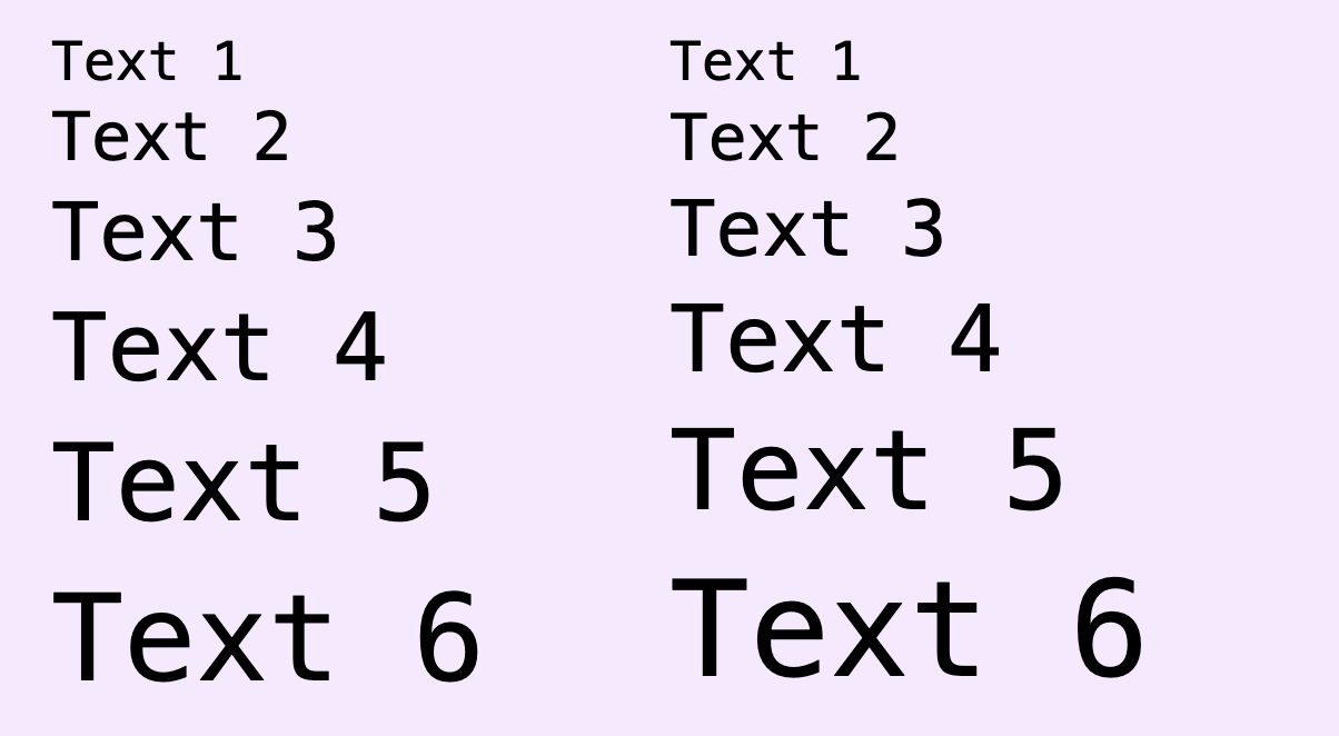
Compare two type scale examples below. The left increases the font size by 6 points each step, while the right increases the size by the ratio of 1.2x (each step is 20% larger than the previous). You can see the change between each step appear to decrease as the size increases in the left example, while the change feel more consistent in the right example.
下の2つのタイプスケールを比べて見ましょう。左の例では、フォントサイズがステップごとに6ポイントずつ増加しますが、右の例ではステップごとに20%増(1.2倍)の比率でサイズが増加します。左側の例では、サイズが増加するにつれて各ステップ間の変化が減少しているように見えますが、右側の例では変化がより一貫して感じられます。
In real situations, there are other ways besides size to indicate emphasis or hierarchical order, such as weight. The actual range of size can be constrained by the available real estate (e.g., mobile screen vs. magazine layout). And after all, it’s up to your choice of style. However, this general principle is worth remembering.
実際のデザインでは、階層的な順序を示したり、強調する方法、はウェイトなどサイズ以外にもありますし、選べるサイズの範囲は、媒体の大きさ(モバイルの画面や雑誌のレイアウトなど)によっても制約されます。最終的にはあなたのスタイルの選択次第でもあります。ですが、この一般原則は覚えておく価値があるでしょう。
The relationship between font size and steps can be expressed using exponential or logarithmic functions too. is the base size, and is the ratio between steps.
フォントサイズとステップの関係はやはり指数関数や対数を使って表すことができます。 は基準となるサイズ、 はステップ間の比です。
Containers and shapes
枠や形
Similarly, the example below illustrates different sizes of boxes defined based on 16px increments, vs a 1.2x ratio. Do you see the difference between the approaches.
同様に下の例では、16pxごとにサイズを変えたボックスと、1.2倍の比率を用いた場合を比べています。アプローチによる違いがわかるでしょうか。
Below is another example comparing 48px increments to a 1.5x ratio.
以下は、48pxづつの場合と1.5倍の場合を比べた例です。
You can choose an approach based on your purpose. If you prefer organizing your design using a specific size as a unit, the incremental approach can work well. If you want to maintain a consistent perceptual jump between sizes, using ratios might be more suitable. Or, you can combine both approaches by using a ratio and rounding the numbers to fit multiples of a certain unit.
目的に応じてアプローチを選びましょう。特定のサイズを単位としてデザインを整理したい場合は、一定の数を足していくアプローチが機能します。サイズ間の知覚的な変化を一定に保ちたい場合は、比率の方が良いかもしれません。両方のアプローチを組み合わせて、比率を適用した後に、特定の単位に合わせて数値を丸めることもできます。
More examples
その他の例
This pattern is not a ground truth but rather a general principle or guideline that helps us understand the relationship between the physical magnitude of a stimulus and our perceived intensity or strength of that stimulus. As mentioned throughout this page, considering this principle can help in understanding and designing in many areas. You can apply this principle strictly or loosely. To conclude this page, here are some examples to think about:
-
Color contrast: The use of shading, color combinations and contrast work in paintings and graphic design
-
Layout composition: How does the principle apply to composition in general, not just sizing of elements
-
Animation: How do human perceive quality of motion, e.g., change in speed
-
Sculpture/3D design: The use of proportion and scale in 3D
-
Sound design/Music Production: How does the principle apply to various aspect of music, such as tempo, dynamic range, contrast between different sections, etc.
-
Architecture/Space design: How spatial distribution, e.g., variations in the size of rooms and hallways influence our perception of space and ambiance
このパターンは、紛れもない事実というよりは、刺激の物理的な大きさと人間に知覚される強度や力の関係を理解するための一般原則、ガイドラインです。このページを通じて触れたきたように、この原則について考えることは多くの分野で、物事の理解やデザインの役に立ちます。この原則は厳密に適用することも、緩く使うこともできます。締めくくりとして、下の例について考えて見ましょう。
-
色の対比: 絵画やグラフィックデザインにおける陰影、色の組み合わせ、対比の使いかた
-
レイアウト構成: 要素のサイズだけでなく画面構成一般について、この原則をどのように適用できるか
-
アニメーション: 人はどのように、速度の変化などの動きの質を捉えるのか
-
立体作品/3Dデザイン: 3Dでの比率やスケールの使い方
-
サウンドデザイン/音楽制作: テンポやダイナミックレンジ、異なるセクション間の対比など、音楽のさまざまな側面にこの原則をどのように適用できるか
-
建築/空間デザイン: 部屋や廊下のサイズの変化など、空間の分割の仕方がその空間や環境の認識にどう影響するか