Resolution 解像度
Resolution is a very intriguing concept that lies between what we can express and what we can sense.
解像度は私たちが表すことができるものと、感じとることができるものの間に位置するとても面白い概念です。
The word “resolution” is most often used to mean the number of pixels in a digital image. For example, a 4K (UHD) TV has a resolution of 3840 x 2160 pixels. But the concept of resolution is not just about “digital” or “image,” but covers a much broader range of things.
「解像度」という言葉が最もよく使われるのは、デジタル画像のピクセルの数を指す場合です。例えば、4K(UHD)テレビの解像度は3840 x 2160ピクセルです。ですが解像度の概念は「デジタル」や「画像」だけにとどまらず、ずっと幅広い範囲に当てはまります。
Resolution generally has two meanings. The first is the ability to distinguish fine details and differentiate between two points that are close together in space, time, or on other axes. The second is the characteristic of how well a digital or analog system can reproduce fine details of the subject, including visual, auditory, and other sensory or informational sequences.
一般的に解像度には2つの意味があります。1つ目は、細かなディティールを識別し、空間、時間、または他の軸上で近接する2点を区別する能力。2つ目は、デジタルまたはアナログシステムが視覚、聴覚、その他の感覚や情報系列の細部をどれだけよく再現できるかという特性です。
What is truly intriguing is not just the numbers themselves, but rather how they relate to our perception. On this page, we will explore the relationships between different resolutions and their effects.
本当に興味深いのは、数字自体よりも、それが私たちの認識にどう関わっているかです。このページでは、異なる解像度とその効果との関係について見ていきます。
Resolutionは日本語では「解像度」または「解像能」と訳されます。画像の解像度のようにある情報をどれくらい細かく分割してデータ化するかについては「解像度」、人間や機器によってどれだけ細かく情報を見分けられるかについては「解像度」、または「解像能」が用いられるようです(英語で違いを明確にしたい場合は”Resolving power”ということもあります)。
Visual system
視覚システム
For an optical system, the resolution refers to the capability to distinguish between two very closely spaced points as separate entities, such as the tiny details of bacteria, or dark stars and nebulae within a tiny fraction of the sky.
光学系では解像度は、細菌の細かなディテールや、空のほんの小さな部分にある暗い星や星雲など、とても近くにある2点を別々の存在として識別する能力を指します。
The screen of the MacBook I’m writing on now consists of many very tiny shining dots, but I can barely see them. The outlines of the text look very smooth and crisp, and the pictures look great. This means that the size of the pixels is beyond the resolution of my eyes, or the ability to distinguish pixels. There are about 250 pixels per inch on this screen, and at that point, my eyes stop seeing the individual pixels but only see the shapes and graphics that the pixels collectively make.
今この記事を書いているMacBookの画面は、非常に小さな光る点で構成されていますが、これらの点はほとんど目に見えません。文字の輪郭はとても滑らかかつ鮮明で、画像もとても綺麗に見えます。これは、ピクセルの大きさが目の解像度、つまりピクセルを区別する能力を超えていることを意味します。この画面には1インチ(2.54cm)あたり約250個のピクセルがありますが、このレベルになると目は個々のピクセルを見るのをやめ、ピクセルが集まって作る形状やグラフィックだけが見えるようになります。
It varies from person to person and the distance at which you look at it, but in general, pixels or a series of dots become indistinguishable at around 200 to 300 ppi (pixels per inch) or dpi (dots per inch). This range is common in both printing and computer screens. Very high-quality printing, such as Giclée prints, can be 1200 ppi or more.
人や見る距離にもよりますが、一般的には、ピクセルや点の列は約200から300 ppi(pixels per inch)または dpi(dots per inch)で識別できなくなります。この範囲は印刷とコンピュータ画面の両方で共通です。ジクレー印刷のような非常に高品質な印刷では、1200 ppi以上になることもあります。
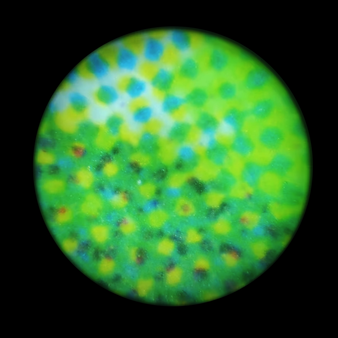
Devices like microscope or telescope can enhance our ability to distinguish the details. For example with a microscope, you can clearly see the dots of ink that comprise a print. The resolution of a microscope is usually represented by the smallest distance between two points that can still be distinguished as separate entities, and is measured in units like micrometers (µm) or nanometers (nm).
顕微鏡や望遠鏡のような機器は、私たちの詳細を識別する能力を強化してくれます。例えば顕微鏡を使うと、印刷物を構成するインクの点をはっきりと見ることができます。顕微鏡の解像度は通常、マイクロメートル(µm)やナノメートル(nm)といった単位で表され、これは2つの点を別々のものとして区別できる最小距離です。
Seeing things at a very small scale (microscope) or very far away (telescope) is not just about magnifying the image. Capturing and interpreting the light or other signals accurately can be very challenging at these scales, as they can be affected by interference, atmospheric conditions, or other distortions. Nowadays, we have various methods to observe things beyond visible light. For instance, electron microscopes use electrons instead of light to achieve higher resolutions for tiny objects. In astronomy, scientists also utilize different types of radiation beyond visible light, such as gamma-rays and radio waves, to observe space.
非常に小さなスケール(顕微鏡)や非常に遠く(望遠鏡)の物を見ることは、画像を拡大するだけではありません。こうしたスケールでは光やその他の信号を正確に捉えるのが非常に困難になり得ます。干渉や、大気条件、その他の歪みによる影響を受ける可能性があるからです。現在では、可視光線を超えて物事を観察するさまざまな方法があります。例えば、電子顕微鏡は光ではなく電子を使用して、微小な物体に対しての高い解像度を実現します。天文学では、科学者たちはガンマ線やラジオ波など、可視光線以外の様々な放射線を使って宇宙を観察します。
Pixels
ピクセル
It hasn’t been too long since the pixels became too small to see. Retina Display and XHDPI mobile devices started to come around in the early 2010s, and it took a little bit for laptops and desktops to catch up. Low-resolution displays are still around and widely used, especially outside of these high-end general-purpose computers.
ピクセルが見えないほど小さくなったのはそれほど昔のことではありません。Retina DisplayやXHDPIのモバイルデバイスは2010年代はじめに出始め、ラップトップやデスクトップが追いつくのにはさらに少し時間がかかりました。低解像度のディスプレイもまだ出回っていて、特にこれらの高性能な汎用コンピューター以外では広く使用されています。
It’s not uncommon to see a constraint of the technology yield unique aesthetics that wouldn’t be there otherwise. Low screen resolution (and shallow color depth, as we’ll discuss later) has created the pixel art style originated from early computer games, pixelated type designs, and so on.
技術の制約が元々存在しなかったユニークな見た目や美意識を生み出すことも珍しくありません。低解像度の(そして後で説明するように、色深度が浅い)スクリーンは、初期のコンピュータゲームから生まれたピクセルアートのスタイルや、ピクセルベースのタイプデザインなどを生み出しました。
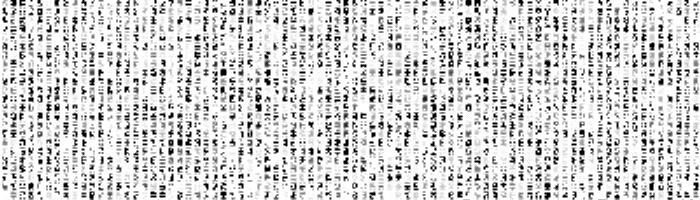
“Matrix” style text from the Matrix page on the book of shaders.
The demo below emulates low resolution by dividing an image into cells and sampling the center of each cell.
下のデモは、画像を碁盤状のセルに分割し、各セルの中心をサンプリングすることで、低解像度の状態を再現します。
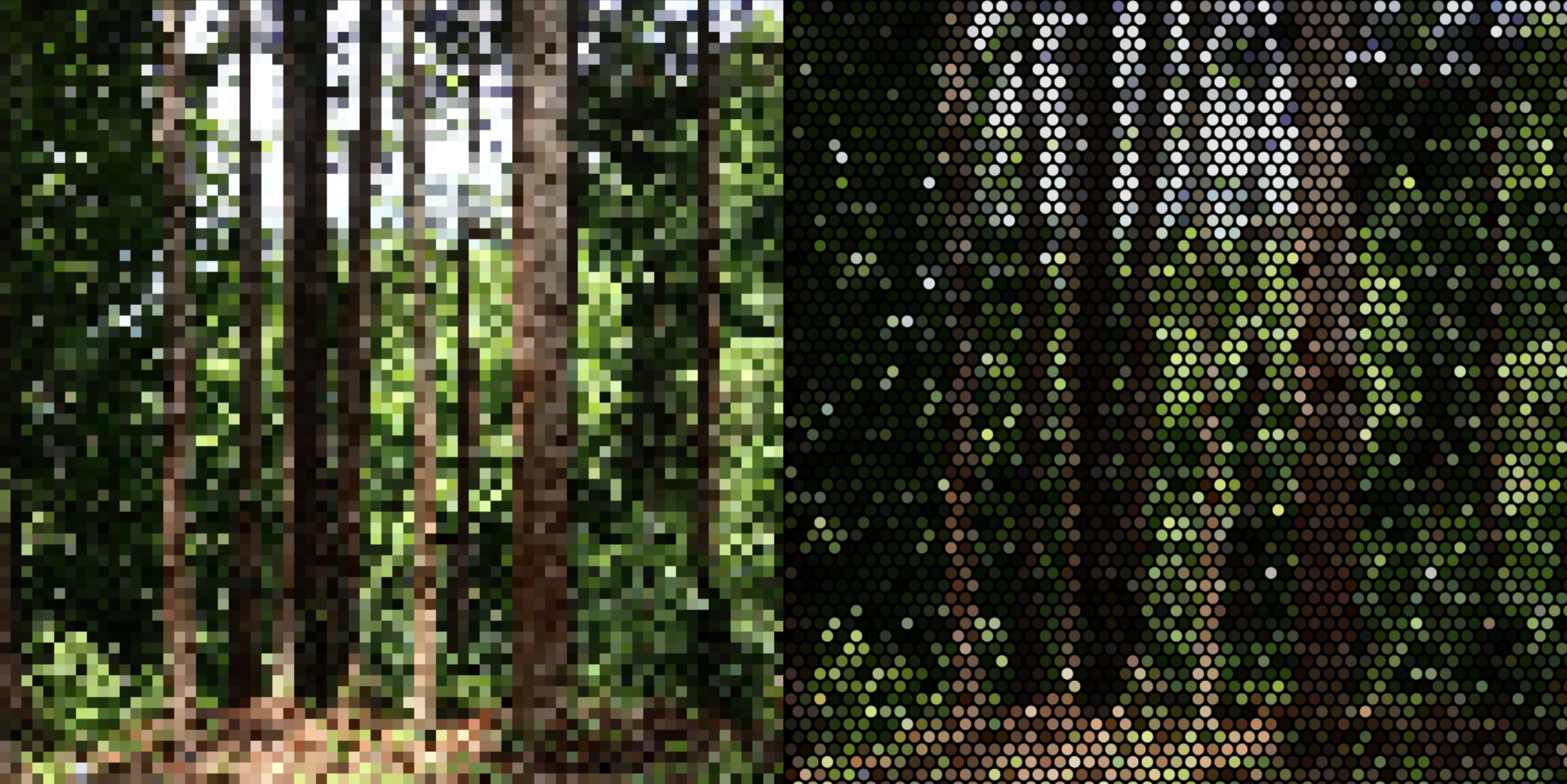
As you can see, from a certain point, it becomes difficult to recognize what is in the image. For lower resolution, symbolic pictures can often work better than a photorealistic approach. The picture below lacks all the nuanced details, but it can convey a key concept (there are several trees) much clearer with a lot fewer pixels.
見ての通り、ある時点から画像の中に何があるのか判断するのが難しくなります。低解像度の場合、写実的なアプローチよりも象徴的な絵の方がよく機能することが多々あります。下の画像は、一切のディテールを欠いていますが、はるかに少ないピクセルで要点(何本かの木がある)をずっと明確に伝えることができます。
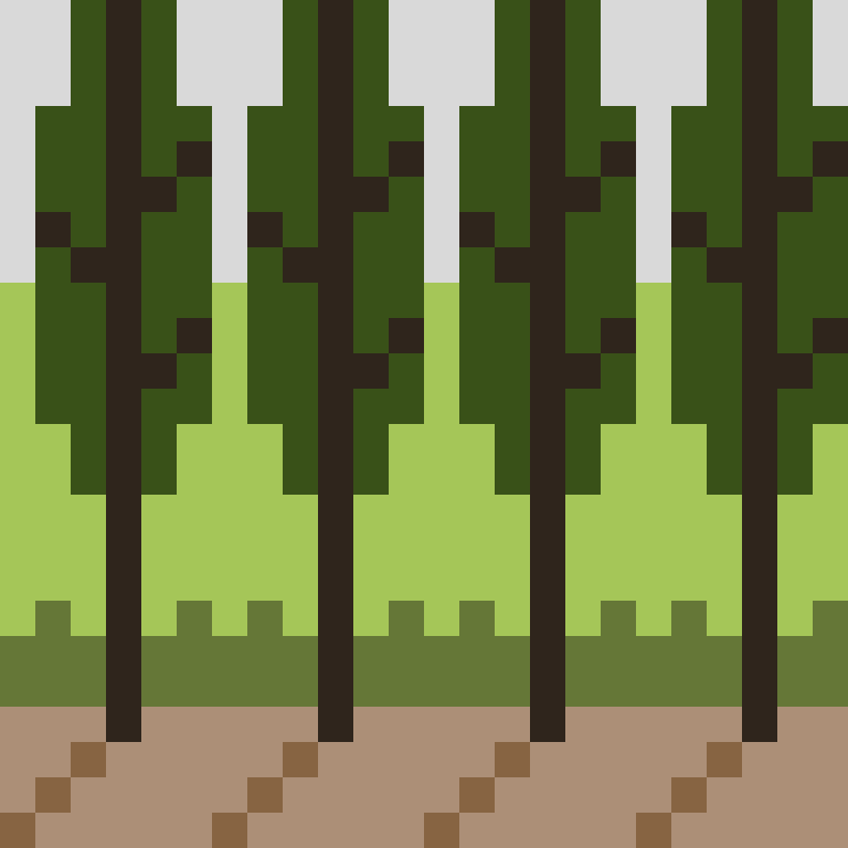
By the way, no real pixels are actually square except for some black and white LCDs. They consist of tiny segments of red, green, and blue lights. So what we think of as “pixel art” like the woods above is an idealized picture of pixels.
ところで、実際のピクセルは実際には正方形ではありません。ピクセルは、赤、緑、青の微細な光のセグメントから成り立っています。我々が「ピクセルアート」と呼んでいるもの、例えば上の森の画像のようなものは、ピクセルを理想化した表現です。
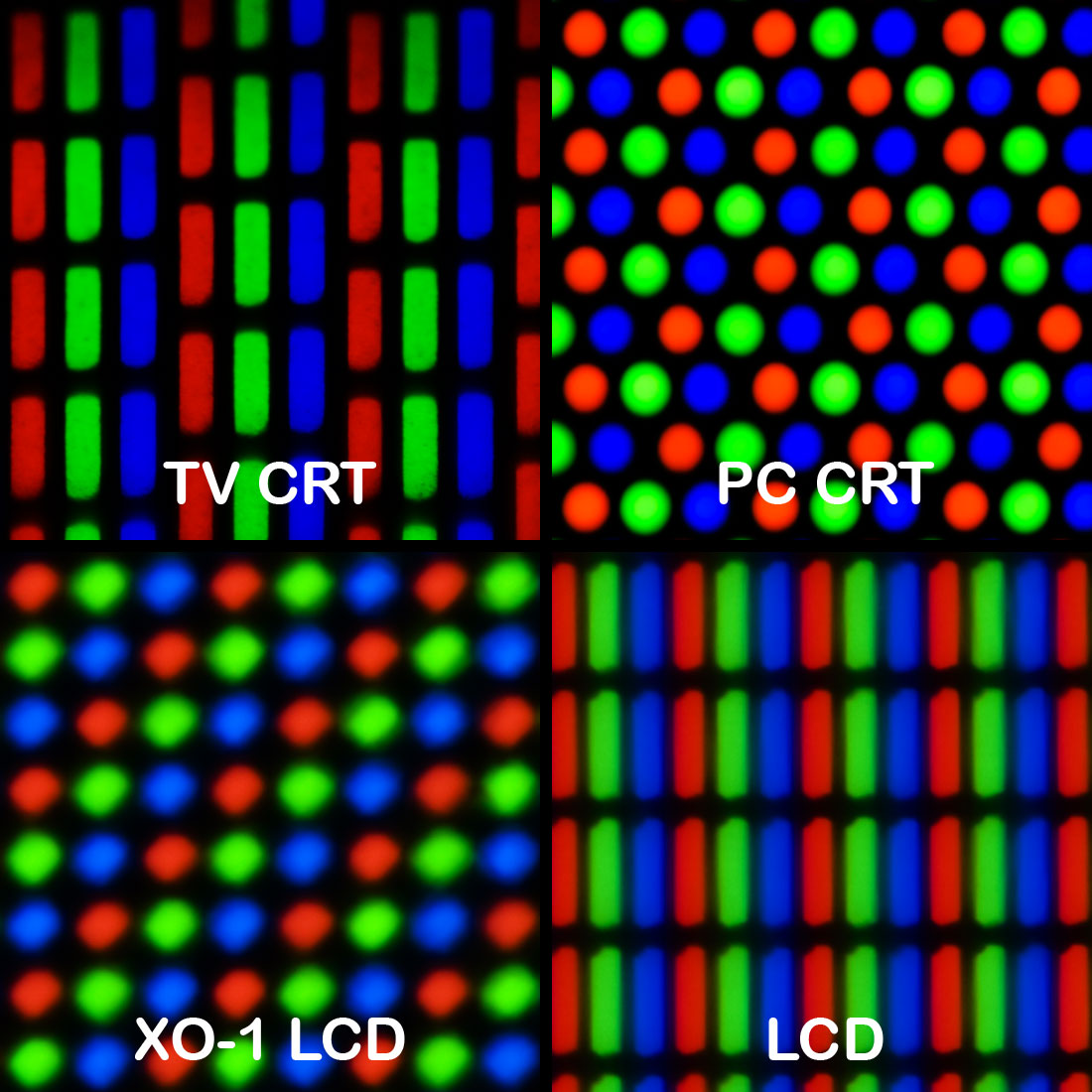
Geometry of color elements of various CRT and LCD displays - Wikimedia
Printing
印刷
Printing also breaks down an image into tiny dots. Unlike screens that are made up of light-emitting pixels, prints comprise different colors of inks that absorb specific light frequencies. An image is typically separated into different layers, each for a different color of ink. The most common color system for printing is 4-color CMYK, which stands for cyan, magenta, yellow, and black. Each layer is a grid of dots, rotated at different angles to avoid the moire effect.
印刷もまた、画像を微細な点に分解します。スクリーンが光を放つピクセルで構成されているのに対し、印刷物は特定の光の周波数を吸収する異なる色のインクで構成されています。画像は通常、異なる色のインクごとにレイヤーに分けられます。印刷で最も一般的な色系統は4色のCMYKで、これはシアン、マゼンタ、イエロー、ブラックを表しています。各レイヤーに点がグリッド状に並んでいて、モアレ効果を避けるためにそれぞれが異なる角度で配置されます。
The demo below simulates CMYK printing.
以下のデモはCMYK印刷をシミュレートしたものです。
Image resolution and human perception
画像の解像度と人の知覚
There is something really intriguing about how our brain always tries to compensate for the missing information. When we see a picture with low resolution, our brain tries to “make sense” of it. This ability does seem to be affected by “how” the resolution is lost. The two images below are not too different in terms of the number of divisions, i.e., how many colored cells there are, but many people would find the images on the left to be of poor quality, compared to the image on the right which appears more photorealistic and of higher quality, probably due to the more obscure shape (circle), arrangement, and some gaps between these cells.
我々の脳が常に欠けている情報を補おうとするその働きには、とても惹きつけるものがあります。低解像度の画像を見ると、脳はそれを「理解しよう」と試みます。この能力は、「どのように」解像度が失われるかによって影響を受けるようです。下の2つの画像は分割の数、つまり色のついたセルの数を比べる限りさほど違いはありませんが、多くの人が左の画像を低品質と感じ、右の画像をより高品質で写真のように感じるでしょう。これはおそらく、形(円形)の不明瞭さや配置、セル間の隙間などの要素によるものです。
There is a duality between the picture we see and the medium. The examples above suggest that even when seeing the same image, we both see the forest - what is depicted, and the pixels - the medium that was used to picture the forest.
人が見る絵とその媒体との間にはある種の二元性が存在します。上記の例は、同じ画像を見ているときでさえ、私たちは森、つまり描かれている対象だけでなく、その森を描くために用いられた媒体であるピクセルも同時に認識していることを示しています。
Or the printing dots demo might remind you of Seurat’s pointillism paintings. From far away, you would see the people with somewhat simplified form, but if you get closer you’ll start to see the dots of various colors, and the shapes of the motifs start to dissolve.
また、印刷の網点デモは、スーラの点描法の絵を思い起こさせるかもしれません。遠くから見ると、形がやや簡略化された人々が見えますが、近づくと様々な色の点が現れ始め、モチーフの形が融け始めます。
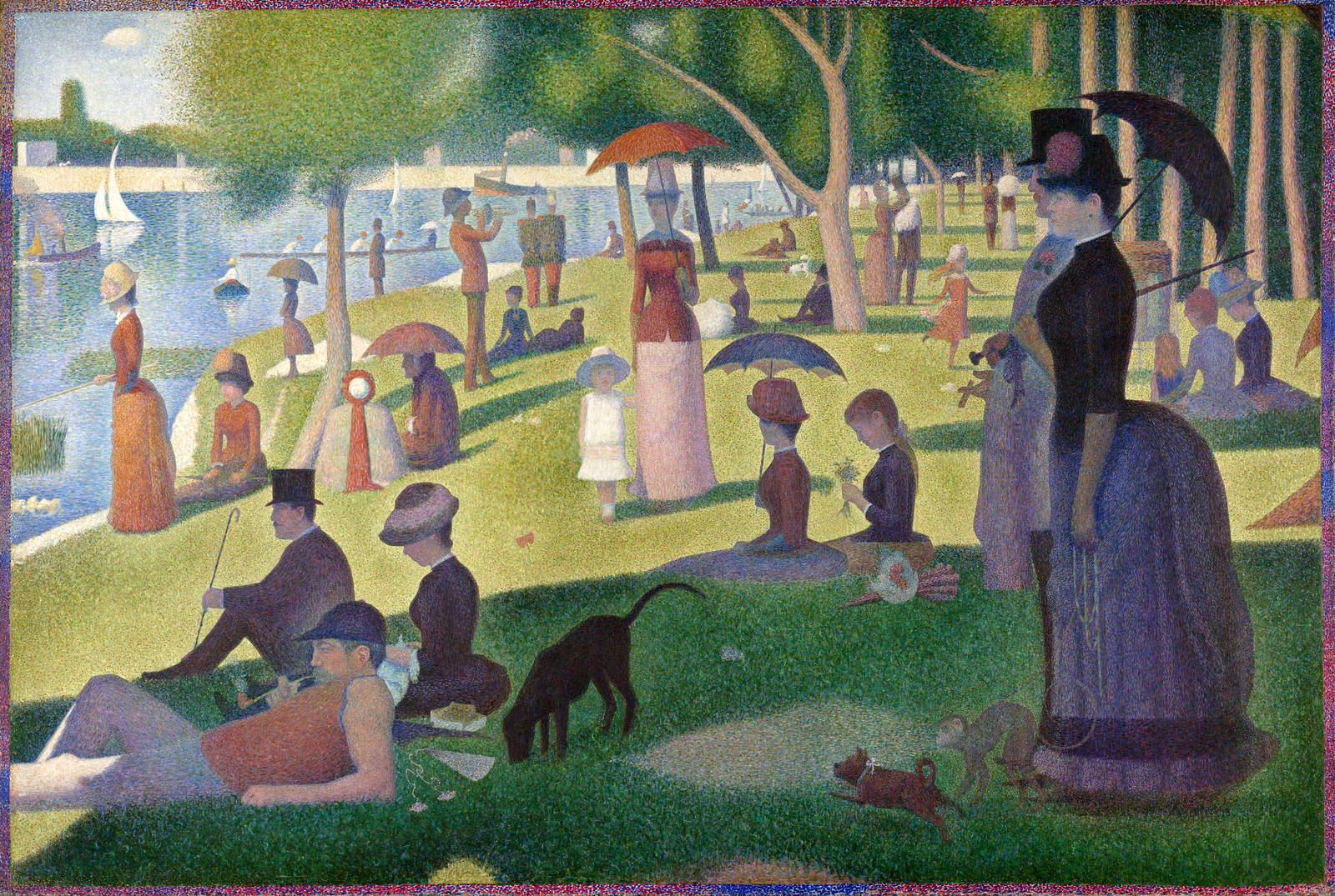
Georges Seurat, A Sunday on La Grande Jatte (Wikimedia Commons)
Looking at the history of painting, Western culture has spent a lot of time focusing on the fidelity and resolution of the picture. The artists would study and practice drawing shapes, like human bodies and drapes of cloths, so that they could paint even what they had never seen, such as saints and angels, sharply and realistically so that the spectator can only focus on what is being depicted.
絵画の歴史を見ると、西洋文化は画像の忠実性と解像度に多くの時間を費やしてきました。芸術家たちは人間の体や布のドレープなどの形を研究し、練習することで、聖人や天使のように彼らが見たことのないものでさえ、鮮明かつリアルに描けるようになりました。その結果、観客は描かれているものにだけ注目することができます。
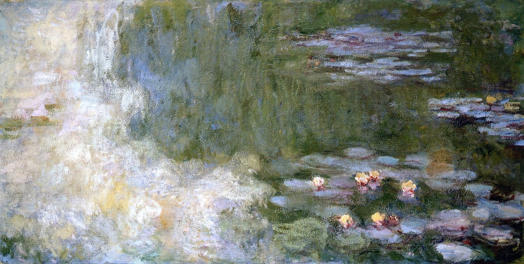
Claude Monet, The Water Lily Pond (Wikimedia Commons)
Impressionism was probably the point when this started to change drastically. In Monet’s water lilies paintings, the water and the lilies are sort of blended together without clear outlines of details. They are at a very low resolution in that sense. One could argue that the paintings capture the “impression” of the light or the scene more effectively, but they also demonstrate the duality between the picture and the medium by exposing more raw brushstrokes that are less pretending to be a part of an object. This shift would pave the way for further explorations into abstraction in the 20th century, but leaving that aside for more historical and theoretical materials, let’s see if we can play with this this observation in a sketch.
変化の始まりは、おそらく印象派に見ることができます。モネの睡蓮の絵では、水と睡蓮が明確な輪郭やディテールなしに溶け合っており、その意味では解像度が低いとも言えます。これらの絵は、光や風景の「印象」をより効果的に捉える一方で、物体の一部として描かれているというよりも生の筆跡が露わになっていることで、絵と媒体の間の二元性をも示しています。この転換は、20世紀における抽象化へのさらなる探求への道を開くものとなりましたが、その歴史的、理論的な側面は置いておいて、この観察を元にスケッチで遊んでみましょう。
This demo below takes a pixelated image of the forest and applies noise-based image processing to make it look like it was roughly painted with brushes. This effect compensates for the lack of detail with nuanced ‘touches,’ potentially tricking our brain into perceiving (or hallucinating) details that were not present in the original pixelated image.
下のデモではピクセル解像度を落とした森の画像に、ノイズを元にした画像処理を適用し、筆で大ざっぱに描いたかのように見せています。このエフェクトは、欠如した情報を趣のある「タッチ」を加えることで補い、脳を騙して(幻を見せるかのように)元の荒いピクセルの画像には存在しなかった詳細までも感じさせる事ができます。
This is a side note on the brain supplementing missing details. The example below shows what the phrase “hawk’s claw” in Japanese would look like at low resolution. While it is impossible to discern the individual strokes on the first character (“taka” - hawk), those fluent in the language would have little trouble reading it due to their familiarity with the overall shape and the phrase itself. However, learners of the language may struggle to identify the characters.
これは、脳が欠けている詳細を補う働きについての余談です。下の例は「鷹の爪」という日本語のフレーズが、低解像度でどう見えるかを示しています。「鷹」の文字は個々のストロークが識別できません。日本語に精通した人は全体の形やフレーズそのものを見慣れているので、ほとんど困難なく読めますが、日本語を学習中の人は文字の識別に苦労するかもしれません。

,_Ein_Sonntagnachmittag.png)
Color depth
色深度
Pixels or printing dots divide the image on a 2D plane, but there is another axis to consider - color depth. In a digital image, each pixel is represented by numbers corresponding to different color channels, and there’s a resolution about how much we divide the brightness of a channel between the darkest and the brightest. In the real world, we can find an almost infinite spectrum of colors. But to represent them as data, we need to map them to a certain range of digital numbers. This mapping from continuous infinite values to a smaller set of discrete finite values is called quantization.
ピクセルや印刷の網点は画像を2D平面上で分割しますが、他にも考えられる軸として色深度があります。デジタル画像のピクセルそれぞれは異なる色のチャンネルに対応した数値で表され、このチャンネルには最も暗い値と最も明るい値の間をどれだけ分割するかについての解像度があります。実世界にはほぼ無限の色のスペクトルがありますが、データとして表現するためには色をある範囲のデジタルな値にマッピングする必要があります。このような連続的な無限の値から、離散的で有限の値からなる小さな集合へのマッピングを量子化(クォンタイゼーション)と呼びます。
Most computer displays today support 8-bit per channel, which means each color channel (Red, Green, Blue) has 256 different shades (from 0 to 255). The demo below emulates different color depths from 3-bit (8 levels) to 8-bit (256 levels). You can see how it transitions from distinct color blocks to smoother gradients.
今のコンピュータの画面の多くは8ビットチャンネルに対応していて、それぞれのチャンネル(赤、緑、青)に256段階の明るさ(0から255)があります。下のデモは、3ビット(8段階)から8ビット(256段階)までの異なる色深度を再現します。はっきりと色がブロックに分かれた状態から滑らかなグラデーションまで変化する様子が見られます。
But even 8-bit, with 255 levels, is still not sufficient to create a truly smooth gradient. Considering the number of pixels on today’s displays (the display I’m working on now has about 3000px horizontally), you would still see jumps between different shades, causing the Mach banding effect, which emphasizes the line where the level changes.
しかし、8ビット、255段階でも、本当に滑らかなグラデーションを作るには足りません。最近のディスプレイのピクセルの多さだと(今、作業しているディスプレイは横に3000px近くあります)、まだ異なる色の間の段差が見え、色の変わり目の線が強調されるマッハバンディング効果を引き起こします。
Or we can think of the range of brightness that human eyes can perceive. In terms of illuminance, a sunny day can be about 100,000 times brighter than a night with moonlight. This doesn’t directly translate to the range we need to reproduce for a realistic viewing experience, because pupils open and close to adjust the amount of light that enters the eyes to be adequate for the range that the retina can handle. But, it’s clear that 8-bit is not enough to capture a real environment. For this reason, digital cameras use the RAW format, which can have 12 to 16-bit depth to store information. HDRI (High Dynamic Range Imaging) formats are also commonly used in 3D, film production, etc.
または、人間の目が認識できる明るさの範囲を考えても良いでしょう。照度を測ると、晴れた日は月明かりの夜の約100,000倍の明るさがあります。瞳孔が開いたり閉じたりして目に入る光の量を、網膜に対して適切な範囲に調整してくれるので、この値がリアルな視聴体験を再現するために必要な値の範囲を直接示すわけではありません。しかし、8ビットではリアルな環境を捉えるには足りないことも明らかでしょう。このため、デジタルカメラは情報保存のために12から16ビットの深度をもつRAW形式を用います。また、HDRI(High Dynamic Range Imaging)形式も3Dや映画制作などで一般的に使われています。
Dithering
ディザリング
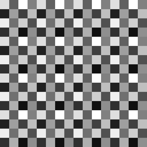
Similarly to low-resolution images, low color depths have created their own aesthetics. For example, a technique called dithering is often used to avoid the Mach band effect. Dithering adds noise or pixel variations to the image to make edges or color transitions less noticeable. A specific type of dithering pattern, known as the Bayer matrix, is often used for this purpose.
低解像度の画像と同じく、低色深度も独自の美学を生み出しました。例えば、マッハバンド効果を避けるためによく使われるディザリングという技術があります。ディザリングは、画像の色の変化や変わり目を目立たなくするために、多少のノイズを加える手法です。この技術には、ベイヤーマトリックスと呼ばれる特定のパターンがよく使われます。
A gray scale Bayer matrix pattern
The demo below applies the dithering effect to the grayscale gradients. Compare this to the demo above. The pixel resolution is also reduced to make the effect easier to see. If you change the pixel size float pixelSize = 8.0 in the code, you can see that dithering can create a pretty smooth-looking gradient even with low color depths.
下のデモでは、グレースケールのグラデーションにディザリングを適用しています。上のデモと比較してみましょう。このデモではディザリングを見やすくするためにピクセル解像度も低くしています。コードの中でピクセルサイズ float pixelSize = 8.0 を変えると、低い色深度でもディザリングによってかなり滑らかなグラデーションが得られることがわかります。
By applying this to an image, you can achieve a classic gaming console vibe.
これを画像に適用すると、クラシックなゲーム機の感じを出すことができます。
Animation
アニメーション
After space and depth, comes time. Let’s think about the resolution on the axis of time. The demo shows the three black circles animated with different frame rate, which is the number of time the graphics is updated within a second. The first circle on the top should be animating at the default frame rate of your environment, the second circle is at the half rate, and the third ball at the one fifth. The first one appears to be quite smooth. The second one is not bad but I see some flickering and afterimages. And with the third one, I can clearly see individual frames.
空間と深度のつぎは時間です。時間軸の解像度について考えてみましょう。デモでは、フレームレートが異なる3つの黒い円のアニメーションが表示されています。フレームレートとは、1秒間にグラフィックが更新される回数のことです。1番上の円は、再生環境のデフォルトのフレームレートで表示され、2つ目の円はその半分のレート、3つ目の円はその5分の1になります。最初のものはかなりスムーズに見えます。2つ目は悪くないですが、ちらつきと残像を感じます。3つ目では、個々のフレームがはっきりと認識できます。
There is a concept very related to the frame rate called Flicker fusion threshold. Imagine a light bulb flickering at a certain rate. When it is slow, you can see it is flickering but at a certain point at about 60 flickers per second (60 Hz) the light start to look continuous. In fact, all the fluorescent lights and LEDs are flickering, but we barely notice it.
フレームレートに密接に関連した概念にFlicker fusion threshold(フリッカーフュージョン閾値)があります。一定の速さで点滅する電球を想像してみてください。ゆっくりであれば点滅していることが分かりますが、約60回/秒(60 Hz)の点滅になると、光は絶え間なく点灯しているように見え始めます。実際、蛍光灯やLEDは皆点滅していますが、ほとんど気づくことはありません。
It doesn’t mean that we always need 60 frames per second (fps) all the time. The standard frame rate for movies is 24 fps, and we usually don’t have any problems. Some people even argue that 60 fps looks “too smooth to be natural”.
とはいえ常に60フレーム/秒(frames per second - fps)が必要なわけではありません。映画の標準のフレームレートは24フレーム/秒ですが、普通はまったく問題を感じません。中には60 fpsは「滑らかすぎて自然に見えない」という人もいます。
Our brain is very good at interpreting what happens between frames. In the animation below, there isn’t a frame where the circle is drawn in the middle of the canvas. In that sense, the animation is quite discontinuous. But most people would perceive a single bouncy ball moving back and forth. A low frame rate, i.e., a low time resolution, can be beneficial in this case, letting the brain read between the frames rather than drawing all the in-between pictures. You can click on the canvas to toggle the frame rate and see how the animation feels different.
脳は、フレームの間で何が起こっているかを解釈するのが得意です。下のアニメーションには、キャンバスの真ん中に円が描かれているフレームは存在しません。つまり、このアニメーションはとても不連続です。にもかかわらず、ほとんどの人は1つの跳ねるボールが左右に動いている様子を見て取るでしょう。この例では、低いフレームレート、つまり低い時間解像度が助けになります。これにより、すべての中間の画像を描かなくても、脳にフレームの間を読ませることができます。キャンバスをクリックするとフレームレートを切り替え、アニメーションの感じ方の違いを観察できます。
Many cartoon animations also employ a technique that let the viewer to anticipate the motion to perceive a certain quality. In this example, squishing the ball at both ends helps create the illusion that the ball is moving really fast in the middle (See: Twelve basic principles of animation).
多くのカートゥーンアニメーションでは、見る人に動きを予測させることである種の質感を感じさせるテクニックも用いられます。この例では、両端でボールを押しつぶすことで、ボールが画面中央で非常に速く動いているような錯覚を作り出しています(Twelve basic principles of animationを参照)。
It’s not always better to be realistic. Sometimes, letting the brain fill in the gaps is better than trying to draw everything in detail and having the illusion fall apart by having discrepancies here and there.
リアルであることが良いとは限りません。すべてを細かく描こうとしてつじつまが合わなくなり、化けの皮が剥がれてしまうよりも、脳に間を補完させた方が良い時もあるのです。
Sound
音
Having discussed the aspect of time, let’s look at another time-driven art form - sound and music.
時間について話したついでに、もう1つ、時間にもとづく芸術の形式である音と音楽について見てみましょう。
Rhythm
リズム
Instead of dividing space, we can create musical rhythm by dividing time. Even within the same tempo and time signature, time can be divided differently, and the way you divide dictates the “feel” of the rhythm. Experienced musicians have a finely tuned resolution of time, meaning they can feel this division more granularly and accurately and precisely position their notes. Many players also adjust the timing slightly off from the exact timing naturally or intentionally to add more nuances, such as heavy or bouncy rhythms.
空間の代わりに時間を分割すると音楽的なリズムを作り出せます。同じテンポと拍子記号で演奏していても、さまざまな仕方で時間を分割することができ、どのように分割するかがリズムの「感じ」を決定します。経験豊富なミュージシャンは時間に対して非常に高い解像度を身につけていて、この分割をより詳細かつ正確に感じ取り、狙い通りに音を配置することができます。演奏者の多くは、自然に、あるいは意図的に、正確なタイミングから微妙にずらすことで重厚な感じや弾んだ感じといったニュアンスを加えたりもします。
The demo below illustrates this concept with very simple examples. You can click on the canvas to toggle between rhythms. All the rhythms are based on 4/4, 120bpm (beats per minute). The first rhythm simply divides a bar into four, playing the bass drum on each beat. The second and third rhythms divide the time more granularly. Both of them add only one extra drum beat to the four bass drum beats, but you’ll likely notice how the position of that single note can change the feel of the rhythm and give a sense of different time units.
下のデモはこれをとても簡単な例で示したものです。キャンバスをクリックするとリズムが切り替わります。すべてのリズムは4/4、120bpm(1分間の拍数)に基づきます。最初のリズムは、小節を4つに分割し、各四分音符でバスドラムを演奏します。2番目と3番目のリズムは、時間をより細かく分割します。どちらも4つのバスドラムのビートに対してもう1つだけドラムの音を足しただけですが、たった1つの音符の位置がリズムの感じをどのように変えるか、異なる時間の単位を感じさせるかに気づけるでしょう。
Click on “Run Pen”, then click one more time to play the sound.
「Run Pen」をクリックした後もう一度クリックすると音が再生されます。
This division doesn’t have to be by multiples of four, or split the time evenly. Some deviation from the strictly measured time can introduce a variety of feels or grooves to the rhythm, enriching its expression.
必ず4の倍数で分ける必要も、時間を均等に分割する必要もありません。厳密なタイミングからわずかにずらすことによって、リズムにさまざまな感じやグルーヴを加えることができます。
Sampling rate
サンプリングレート
Switching the topic to sound as data, we can view the resolution of time from a different angle. The majority of the sound data we hear today uses a sampling rate of 44,100 Hz (or 44.1 kHz), derived from the old standard for CDs. This means that the data divides a second into 44,100 pieces of time, capturing the pressure for each of these fragments, or samples.
データとしての音に話題を移して、時間の解像度について異なる角度から見てみましょう。今日耳にする音のデータの大半は、昔ながらのCDの標準に基づく44,100Hz(または44.1kHz)のサンプリングレートを用いています。これは、データが1秒間を44,100個の時間の断片に分割し、それぞれの断片、つまりサンプルごとの圧力レベルを記録するという意味です。
It’s interesting to think about this in analogy to pixel resolution. Both determine the fidelity to reproduce physical phenomena, but while we can directly see pixels, we never hear individual samples, nor do we directly experience the change in pressure (except for extremely low and loud sounds). Instead, we experience various qualities of sound, such as pitch or timbre. A low sampling rate largely affects the quality of the sound.Let’s see (and listen to) this with examples.
これをピクセル解像度と比較すると面白いでしょう。どちらも物理的な現象を再現する際の忠実性に関わりますが、ピクセルは直接見ることができるのに対し、個々のサンプルを聞いたり、気圧の変化を直接経験することはありません(極端に低くて大きな音を除きます)。その代わり、人は音高や音色などの、さまざまな音の特性を経験します。低いサンプリングレートは音の品質に大きな影響を与えます。例を見て(聞いて)みましょう。
The first demo below is from the page on Sound Visualization. If you click on the canvas, it will play sine wave sounds at random frequencies.
以下の最初のデモは、音の視覚化のページからです。キャンバスをクリックすると、ランダムな周波数のサイン波の音が再生されます。
The next demo does essentially the same thing, except it emulates a lower sampling rate. As you can see, the lower the resolution, the less smooth the waves become, appearing like staircases.
次のデモは基本的に同じですが、低いサンプリングレートの音を再現します。見てわかる通り、解像度が低いほど、波は滑らかさを失い、階段のように見えます。
A low sampling rate is rarely used as it not only impairs the quality of sound but also makes it impossible to reproduce the range of sound we can hear, particularly at higher frequencies. This can be easily understood if you imagine having to draw ten cycles of a wave but you can only use five points to plot. But when fidelity is not the primary goal, you may discover interesting applications for it, such as sound effectors known as bitcrushers that essentially employ this concept.
低いサンプリングレートは音質を損なうだけでなく、人間に聞こえる範囲の音、特に高周波帯を再現することが不可能になるため、まれにしか使用されません。10周期分の波を描きたいのに、プロットには5個の点しか使えない状況を想像すると容易に理解できるでしょう。ですが、忠実性を目指すわけでなければ、面白い用途が見かるかもしれません。例えば、この概念を基本として用いるビットクラッシャーなどのサウンドエフェクターがあります。
Bit depth
ビット深度
Lastly, let’s look at another axis of the sound data. Bit depth is how we quantize the pressure level at a moment in time, or in other words, how many discrete levels we use for each sample in the sound data. In the graphs above, the sample rate is how we divide the horizontal axis, while the bit depth is how we divide the vertical axis.
最後に、音データの別の軸を見てみましょう。ビット深度は、特定の時間での圧力レベルをどのように量子化するか、つまり、音データの各サンプルに対してどれだけの段階を割り当てるかを表しています。上のグラフで言えば、サンプルレートは水平軸をどのように分割するかを示し、ビット深度は垂直軸をどのように分割するかを示します。
A common standard is to use 16bit per sample. There are formats with higher fidelity such as 32-bit audio. But as you can probably anticipate at this point, the next demo reduces the bit depth to illustrate how it works and what effect it has. The demo emulates just 4 bits per sample.
一般的な標準は、サンプルあたり16ビットです。32ビットオーディオのように、より高い再現性を持つフォーマットもあります。しかしもう予想がついていると思いますが、次のデモではビット深度を減らして、その働きや影響を示します。デモでは、サンプルあたりたった4ビットを使った状態を再現します。
We associate “8-bit” with the sound and graphics of a nostalgic 20th-century gaming console vibe. This is not due to the bit depth, but because many of these consoles used 8-bit CPUs.
ノスタルジックな20世紀のゲーム機の音やグラフィックのことをよく「8ビット」と呼びますが、これはビット深度ではなく、これらのコンソールの多くが8ビットCPUを使っていたためです。
Other resolutions
その他の解像度
Throughout this page, we have seen many examples from the perspective of resolution. It is fascinating that the same idea, how we can distinguish things at varying fidelity, or how we represent things with different fidelity, can apply to various things. We have mostly talked about the visual and audio, but this concept can apply to more things.
このページでは解像度の観点から多くの例を見てきました。 様々な精度で物事を区別する能力、または異なる精度で物事を表現する方法、という同じアイデアが様々なことに適用できことには興味をそそられます。 主に視覚と聴覚について話しましたが、この概念は他のことに適用できます。
For example, our skin has resolution both in terms of space and time. If two pen tips touch your skin, you can feel them as two different objects. But as they get closer, it becomes harder to discern them. Some parts of the body, like fingertips, have very high resolution while other parts like the back skin have low resolution. Or if your skin was poked by the pen multiple times, you’d be able to discern each poke. But when the pace gets very fast, there is a point where you start to feel them as continuous pressure.
例えば肌には、空間と時間の両方の解像度があります。2つのペンの先端が皮膚に触れた場合、2つの異なる物体として感られますが、ペン先が近づくとしだいに判別が難しくなります。身体のある部分、例えば指先は非常に高い解像度を持つ一方、背中の皮膚などの解像度は低くなります。また、肌が何度もペンで突かれた場合、それぞれを識別することができますが、ペースが非常に速くなるとある時点から連続した圧力として感じられるようになります。
There are more examples. Resolution is a crucial and fascinating concept in thinking about how we perceive the world and how we can create and control different experiences. If you’re interested, exploring how varying resolutions can alter different experiences could be an intriguing venture.
このような例は他にもあります。解像度は、私たちが世界をどのように知覚し、異なる経験をどのように作り出し、制御するかについて考える際の重要かつ面白い概念です。興味があれば、解像度の違いがさまざまな体験にどのような変化をもたらすか、さらに調査するのも楽しいかもしれません。