Color Processing カラープロセッシング
Color processing involves manipulating the color channels of an image. This includes adjusting the color balance, contrast, or converting a color image to monochrome.
カラープロセッシングでは、色のチャンネルを操作して色のバランスやコントラストの調整、カラー画像をモノクロに変換するといった処理を行います。
All examples on this page use GLSL shaders. To learn more about shaders, please read The Book of Shaders. The pages on shaping functions and colors will be particularly useful.
このページでは、すべてのサンプルでGLSLシェーダを使用しています。シェーダについて詳しく知りたい場合は、The Book of Shadersを読んでください。特にシェイピング関数と色についてのページが役立つと思います。
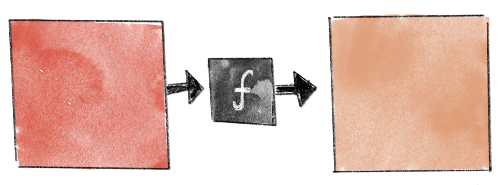
Let’s focus on the color of a single pixel. We can think of color processing as a function that takes the color values of the pixel and converts them to different values. On this page, we assume each pixel has three channels: red (R), green (G), and blue (B), with values ranging from 0.0 to 1.0.
1つピクセルの色だけに注目してみましょう。カラープロセッシングは、このピクセルの色の値を異なる値に変換する関数だと考えることができます。このページでは、各ピクセルに赤(R)、緑(G)、青(B)の3つのチャンネルがあり、値は0.0から1.0までの範囲にあると仮定します。
Brightness and Contrast 明るさとコントラスト
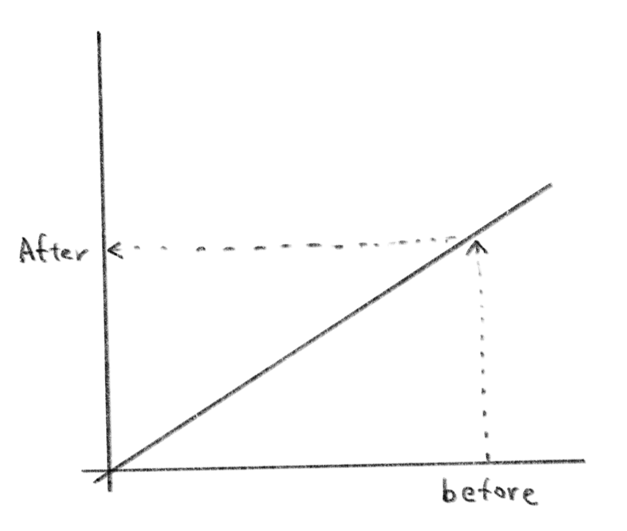
Consider a simple function as shown below. is the original color, while is the color resulting from the process.
下のようなシンプルな関数を考えてみましょう。は元の色で、はプロセスの結果の色です。
This function multiplies the red, green, and blue (R, G, B) values of each pixel by 0.75, resulting in a darker image. The line to the right in the resulting image is the graph of the function, where the x-axis corresponds to the original value and the y-axis to the result. Drawing a graph in this way can help visually understand what the function is doing.
この関数は、各ピクセルの赤、緑、青(R、G、B)の値に0.75を掛けて画像を暗くします。右側にある結果画像の上の線は、関数のグラフです。x軸が元の値、y軸が結果に対応します。このようにグラフを描くことと、関数の動作を視覚的に理解する助けになります。
By moving your mouse over the demo below, you can see the contrast of the image change. Consider why the color changes in this manner by examining the slope of the graph.
下のデモではマウスを動かすと、画像のコントラストが変化します。グラフの傾きを見ながら、なぜこのように色が変化するのか考えてみましょう。
The function does not have to be linear. In the example below, a cubic Bézier curve is applied to the image. The result ranges from fine adjustments to drastic effects that resemble the Sabattier effect. You may have noticed that this is exactly what tone curve feature does in Adobe Photoshop or other image processing tools.
使用する関数は必ずしも線形である必要はありません。以下の例では、三次ベジエ曲線を画像に適用することで、微調整からソラリゼーションのような劇的な効果まで幅広い調整が可能です。これはAdobe Photoshopや他の画像処理ツールで行われるトーンカーブ機能とまったく同じことに気づいた方もいるでしょう。
You can apply different functions to each channel of the R, G, and B channels to change the balance between them.
RGBの各チャンネルに異なる関数を適用して、バランスを変えることもできます。
Converting to monochrome
モノクロームに変換する
In the examples we’ve seen so far, functions were applied to each of the RGB channels separately. However in some cases, we need to consider all three channels together. For instance, to convert an image to grayscale, we must combine the RGB values into a single brightness value.
上記の例では、各RGBチャンネルに対して関数を適用しましたが、場合によっては3つのチャンネルすべてを一緒に考える必要があります。たとえば、画像をグレースケールに変換するには、RGB値を単一の明るさの値にまとめなくてはなりません。
Probably the simplest and most naive way to calculate brightness is by taking the average of the RGB values. The following demo shows the result of this method.
明るさを計算する最も簡単で素朴な方法は、RGB値の平均を取ることでしょう。下のデモでは、この方法の結果が見られます。
It looks successful at first glance. However, do you notice that the yellow and yellow-green parts are darker than the surrounding areas? In the original image, you would probably feel that the yellow below the nose is brighter than the blue part, but the difference is not well-reflected in the converted image. (Perception of colors can vary from person to person. There is nothing wrong if you don’t feel the same way.)
一見うまく変換できたように見えますが、黄色や黄緑の部分が周りよりも暗くなっていることが気にならないでしょうか。元の画像では、鼻の下の黄色の部分が青い部分よりも明るく感じると思いますが、変換された画像ではその差がよく反映されていません。(色の知覚は人によって異なります。同じように感じなくても何も問題ありません)。
One common fix for this issue is to use the Y value from the CIE XYZ model to represent brightness. This method considers the difference in perceptual brightness between different channels. The full conversion matrix can be found on the Various Color Models page, but to get only the Y value, you just need a single line. Compare the demo below with the one above.
この問題を解決する一般的な方法として、明るさにCIE XYZモデルのY値を使用することができます。こ方法では、チャンネルごとの知覚的な明るさの違いが考慮されています。様々なカラーモデルのページには変換行列の全体が載っていますが、Yの値だけを得るには1行あれば十分です。下のデモを上と比べて見ましょう。
If you want a monochrome image with a color other than grayscale, you can choose a base color, then mix it with white using the brightness obtained via the method above.
もしグレースケール以外のモノクロ画像が欲しい場合は、まずベースカラーを選んで、上記の方法で得た明度を用いて白色と混ぜることができます。
However, this method limits the saturation or chroma of the resulting image because the “base color” must be the darkest color, and the saturation can never exceed that of the base color. There are different ways to work around this limitation. In the demo below, umber (0.39, 0.19, 0.27) and ochre (0.59, 0.33, 0.2) are mixed with black and white proportionally to their brightness. This is not strictly “monochrome,” but it looks richer for precisely that reason.
ただし、この方法はベースカラーが最も暗い色でなければならず、中間色の彩度がベースカラーを超えることができないために、結果として得られる画像の彩度を制限してしまいます。この制限に対処するためには、様々な方法がありますが、下のデモでは、アンバー(0.39、0.19、0.27)、オーカー(0.59、0.33、0.2)、白と黒を明るさに応じて混ぜています。これは厳密には「モノクロ」ではありませんが、そのおかげでより表情豊かに見えます。
I personally still don’t like the color of the background; it’s too yellowish. I would consider mixing in one more grayish color for the brighter areas.
個人的には背景の色が黄色すぎるのが気に入りません。明るい部分にもう1つグレーっぽい色を混ぜることを検討しても良いでしょう。
Using different color models
異なるカラーモデルを使う
Using an appropriate color model can make it easier and more intuitive to control different aspects of colors. For example, if you want to work with hue and chroma, you can select a model like HSV or CIE LCh in which these concepts are more directly represented.
適切なカラーモデルを使用すると、色の異なる側面をより簡単かつ直感的に制御できるようになります。たとえば、色相と彩度を操作する場合は、HSVやCIE LChのような、これらの概念がより直接的に表現されたモデルを選択できます。
As a simple example, we will modify the hue and saturation of the colors in the image using the HSV model. Try moving your cursor on the demo.
簡単な例として、HSVモデルを使用して画像の色相と彩度を変化させます。デモの上でカーソルを動かしてみましょう。
The following is the same idea, but using CIE LCh instead. Can you see the difference? To me, HSV tends to look more neon, and different parts of the drawing change hues at different rates. Colors change more evenly in CIE LCh. Also, there is a significant difference if you compare both when desaturated. In general, LCh seems to create a more natural look. However, this does not necessarily mean one model is better or worse, but you can choose a model based on the effect you want.
下記は同じアイデアをもとにCIE LChを使ったものです。違いがわかるでしょうか。HSVの方がよりネオンぽい配色になりがちで、それぞれの部分の色相が異なる速度で変わっているように見えます。CIE LChでは色がより均等に変化します。また、色相が低い状態には大きな差が見られます。全体としてLChの方がより自然な結果になるようです。ただしこれは必ずしも一方が良いとか悪いとかいう話ではないので、欲しい効果に合ったモデルを選ぶと良いでしょう。