Pencils, Brushes and Paints 鉛筆、筆、絵の具
On this page, we will write code using physical tools like pencils, brushes, and paint as inspiration. While there are many great tools available, such as Procreate or Adobe Fresco, or you can simply ask AI to “paint like Van Gogh,” I assure you that you can learn a lot and have fun by doing it yourself. By observing things and attempting to express them in code, you can develop your skills and perspective. The freedom to design your own tools can be an invaluable asset for your creativity.
このページでは、鉛筆、筆、絵の具などの物理的な道具を元にしてコードを書いていきます。ProcreateやAdobe Frescoなどの優秀なツールはたくさんありますし、単にAIに「ゴッホみたいな絵を描け」と頼むこともできるのですが、自分でやってみると楽しく、多くのことを学ぶことがでるでしょう。物事を観察し、それをコードで表現しようとすることで、スキルや物の見方を身につけることができます。自分自身でツールを自由にデザインできるとは、創造性にとって貴重な資産となるでしょう。
This article is a follow-up to the Drawing with code presentations I gave in 2022 and 2023. This article aims to provide a quick introduction to how to implement some of the techniques discussed in the talk. I won’t delve into too many details, but I will include links to relevant materials and add some technical advice at the end. Also, many examples on this page use GLSL shaders. For more information on shaders, please refer to The Book of Shaders (as always).
この記事は、2022年と2023年に行ったDrawing with codeというのプレゼンテーションの補足として書いた物です。この記事では、プレゼンで扱ったいくつかのテクニックを実装する方法について、簡単に紹介します。細かな詳細には立ち入りませんが、関連資料へのリンクと最後にいくつかの技術的なアドバイスを追加しておきますので参考にしてください。また、このページの多くの例ではGLSLシェーダーを使っています。シェーダーに関する詳細は、(いつも通り)The Book of Shadersを参照してください。
Mimicking Pencil Drawings
鉛筆画を模倣する
The pencil is one of the most common drawing materials. It is easy to use even for kids, and yet it is very versatile and profound, with which an artist can spend time forever. Let’s begin by replicating the texture of pencil drawings. Artists often use a technique called hatching, which involves creating shading effects by drawing closely spaced parallel or crossing lines. Why don’t we start with that, because while this can be quite laborious for humans, computers are good at drawing a lot of lines without getting tired.
鉛筆は最もありふれた絵を描く道具の1つです。子供でも簡単に使える一方、とても万能で奥深く、アーティストが永遠に時間を費やすことができるものでもあります。まずは鉛筆デッサンの質感を再現してみましょう。絵描きはよくハッチングという、平行または交差する線を細かく並べて陰影を作り出す技法を使います。これは人間にとっては手間のかかる仕事ですが、コンピュータなら疲れることなく、たくさんの線を疲れずに描けるので、そこから始めてみましょう。
The demo below takes a photo of a forest, selects a random pixel, converts its color to grayscale, and then draws a short diagonal line at the corresponding position in the space to the right. The line is drawn from the top right to the bottom left, just as right-handed people typically do (The opposite direction is easier for left-handed people).
下のデモは、森の写真からランダムなピクセルを選び、その色をグレースケールに変換してから、右側のスペースに対応する位置に短い斜めの線を描画します。右利きの人がよく行うように、線は右上から左下の向きで描かれます(左利きの人にとっては逆の方向のほうが簡単です)。
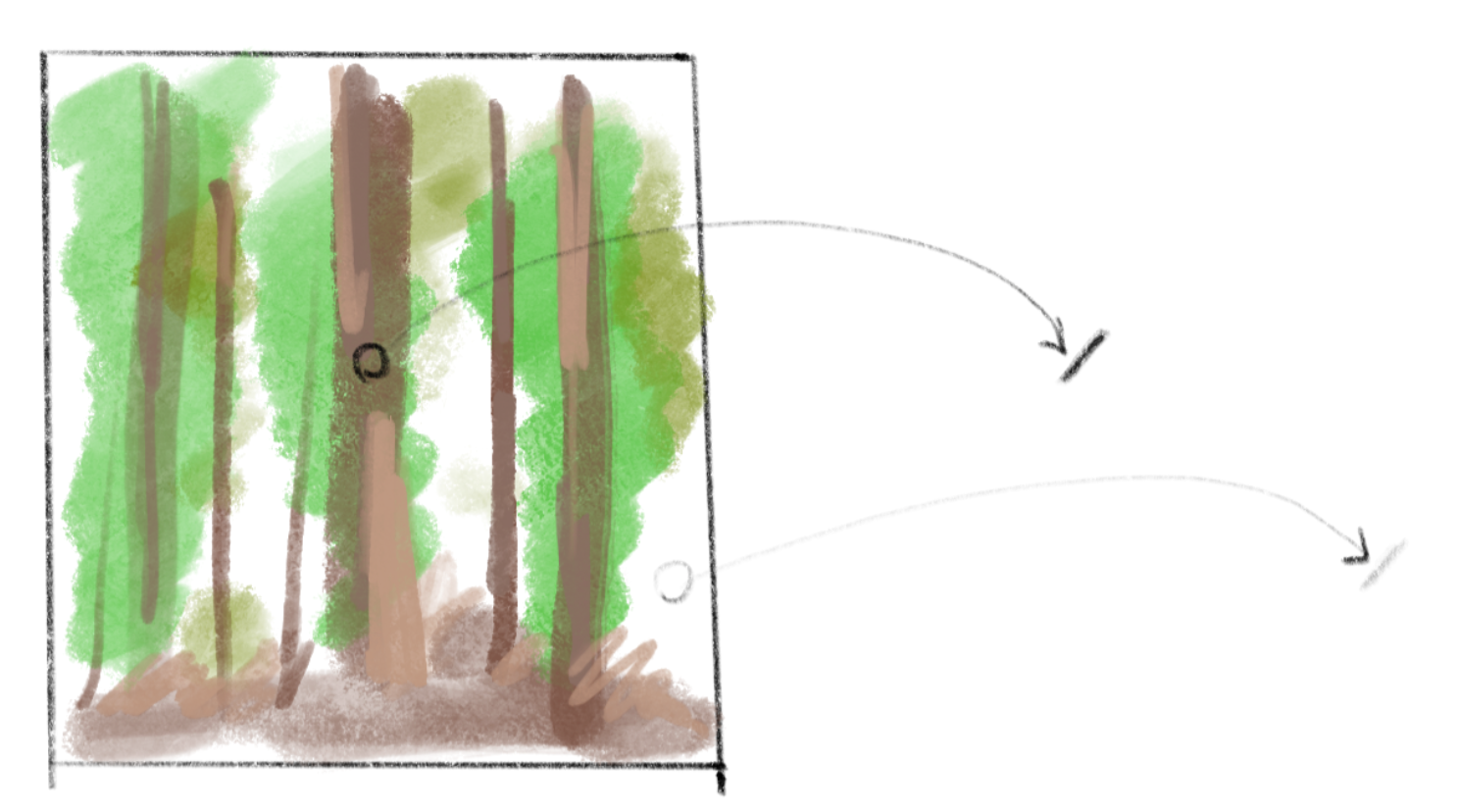
There is a small trick in the code to compare the colors of the original pixels at the starting point and ending point of the line. This is done to prevent drawing a line that crosses two areas with very different colors. This technique helps maintain a sharp contour for the shape in the final drawing.
小さな仕掛けとして、線の始点と終点それぞれの元のピクセルの色を比較するコードがあります。これは、線が、大きく色が異なる2つの領域を横切らないようにするためのこのテクニックで、完成した絵の輪郭を鮮明に保つために役立ちます。
We can also consider the paper, not just the drawing tool. The texture of the paper can greatly enhance the tones created by pencils. The example below adds some grainy noise (actually just random values) to the grayscale image. Although strokes are not defined, the resulting texture resembles the gentle touch of a soft pencil on rough paper.
描く道具だけでなく、紙のことも考えてみましょう。紙の質感は鉛筆のトーンをより豊かにできます。以下の例では、グレースケールの画像に粒状のノイズ(実はただのランダムな値)を足しています。ストロークの線は描かれてきませんが、結果の質感はざらっとした紙の上の優しく柔らかな鉛筆のタッチに似ています。
We can apply a texture to individual strokes too. In the demo below, the texture to the left is created using noise in a GLSL shader (texProgram). Then, another shader is used to interpret the texture as the opacity of the pixels on the stroke.
個々のストロークにテクスチャを適用することもできます。下のデモの左側のテクスチャはGLSLシェーダー(texProgram)でノイズを使って作られています。別のシェーダーを使って、このテクスチャをストローク上のピクセルの透明度として読み取ります。
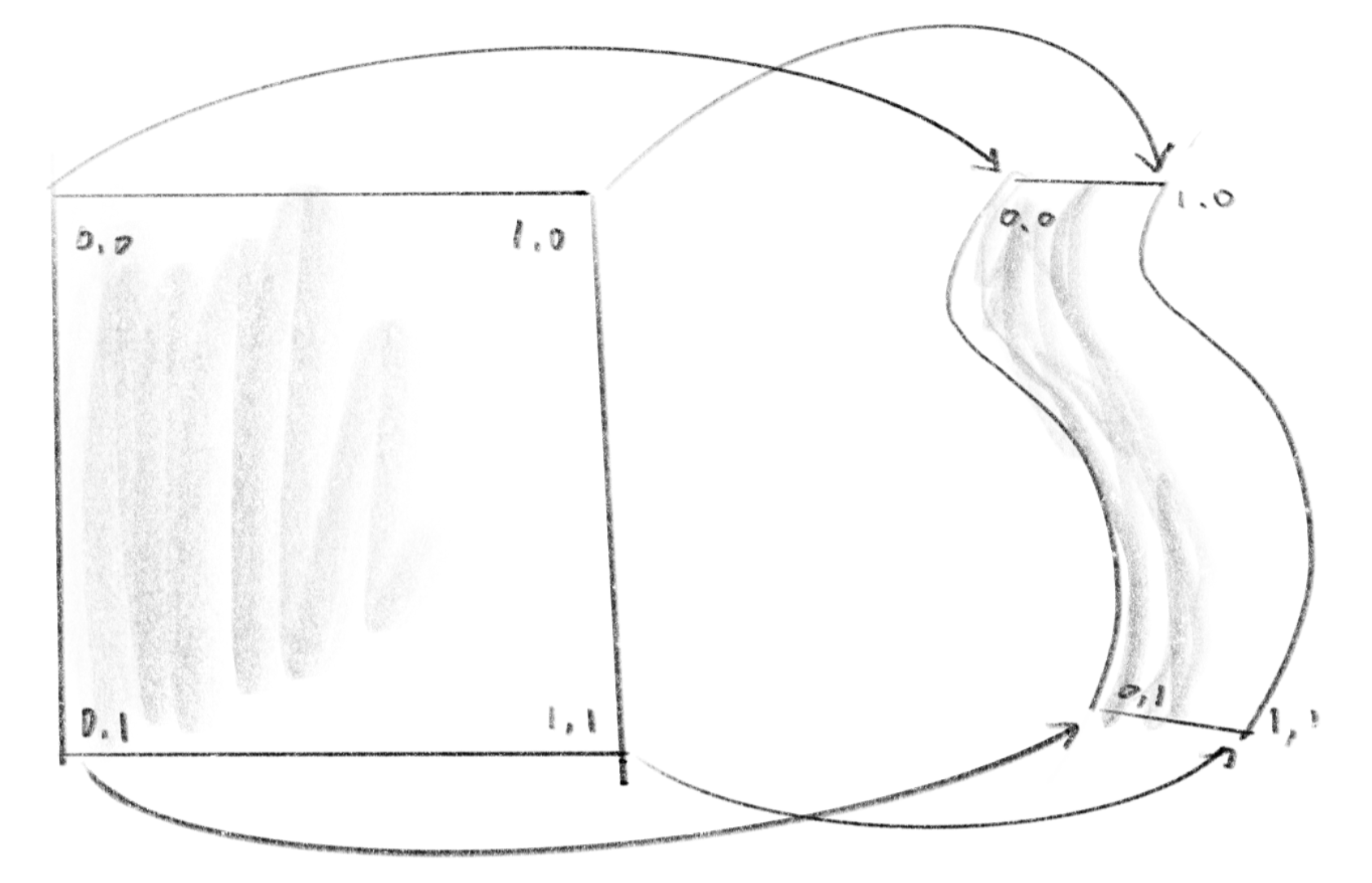
p5.js’s vertex() function lets you specify uv-coordinates, which provide information about where on the texture you want to map to each point in the shape. The uv-coordinate will be passed to attribute vec2 aTexCoord in the vertex shader then to the vTexCoord in the fragment shader. The example breaks the stroke down into many small rectangles and maps a portion of the texture to each rectangle.
p5.jsの vertex() 関数では、各点が形状内のどの部分にテクスチャをマッピングするかを示すuv座標を指定することができます。uv座標は、頂点シェーダーのattribute vec2 aTexCoordを介してフラグメントシェーダーのvTexCoordに渡されます。この例では、ストロークを多数の小さな長方形に分割し、テクスチャをそれぞれの長方形にマップしています。
I tried to draw the stroke as a single connected shape, but the mapping didn’t seem to work well with a shape that has concave sides.
本当はストロークをひと繋がりの形として描こうとしたのですが、凹んだ側面を持つ形状ではマッピングがうまく機能しないようでした。
Brushes
筆
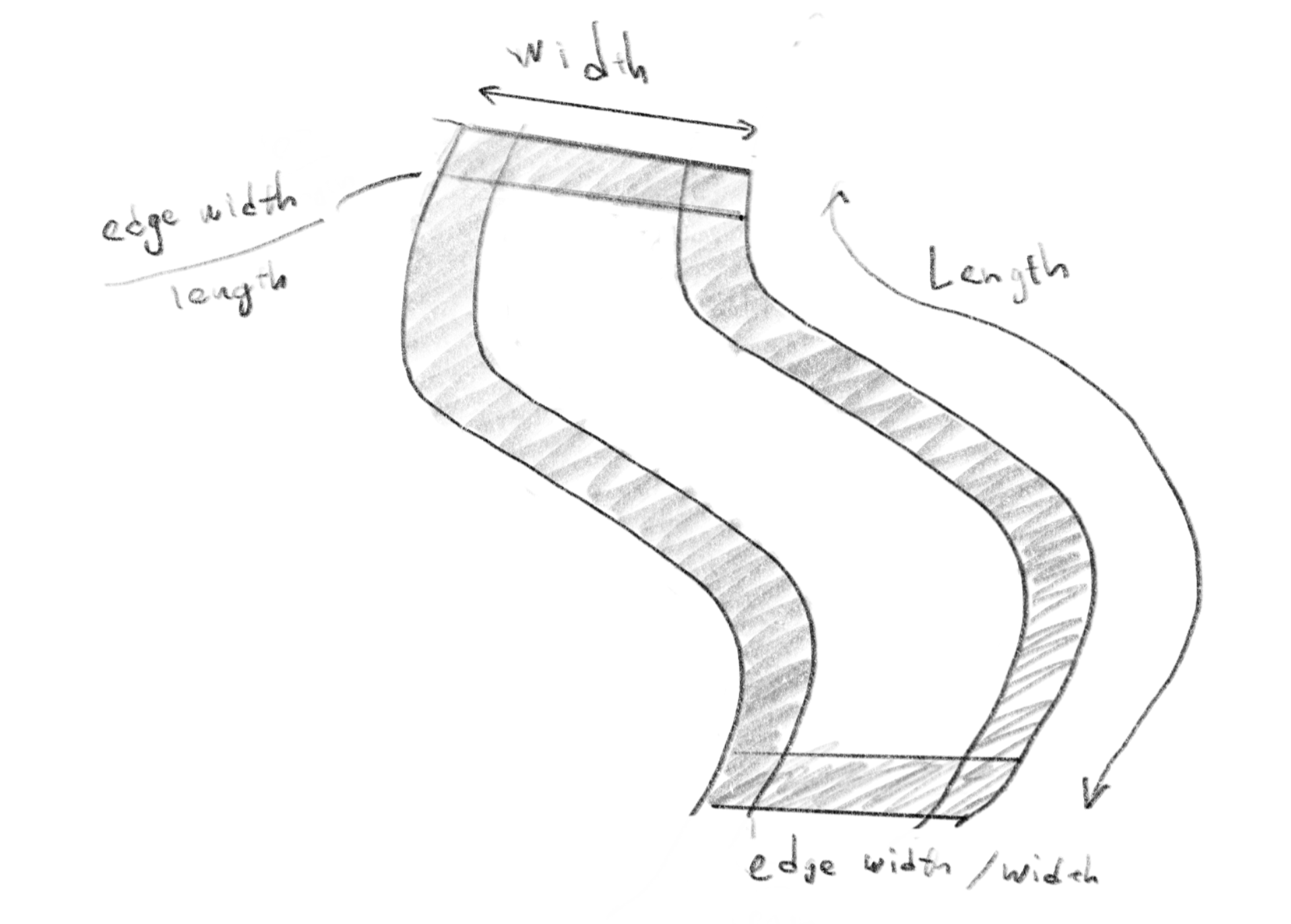
Just like the pencil strokes demo above, we can use various textures to design different types of strokes. For instance, a stroke created by a brush with strong bristles will have a distinctive trace of those bristles following the path. This effect can be mimicked by using a stretched noise texture, as demonstrated below. The noise function used in the shader is exactly the same as the one used in the pencil stroke demo, but by adjusting the parameters, we can achieve a completely different visual result. To create the rough edges, the width and length of the stroke are passed to the shader, which are used to calculate the distance from the edges. Compare the drawing with the code to help in understanding the technique.
上の鉛筆のデモのように、さまざまなテクスチャを使って異なるタイプのストロークを作ることができます。たとえば、毛先の硬い筆のストロークには、その毛先の痕跡が軌跡に沿ってはっきりと残ります。この効果は、下のデモで示すように、引き延ばしたノイズのテクスチャを使用して再現できます。このシェーダーで使ったノイズ関数は、鉛筆のデモで使ったものとまったく同じですが、パラメータを調整することで、まったく異なる効果が得られました。ギザギザなエッジを作るために、ストロークの幅と長さをシェーダーに渡して、輪郭からの距離の計算に使っています。下の絵とコードを見比べて、理解の助けにしてください。
This next example uses the noise to mimic the touch of more watery paint. In the shader, the rounded shape is defined by the distance from the center (which is essentially the same approach as defining a circle with a signed distance function). The noise is applied to this distances to create the jagged contour, as well as the fill inside to create the blurry texture. As a final touch, the distance from the center is also used to create a “coffee ring effect” or the concentration of pigment or particles along the edge. When paint is diluted with a lot of water, it usually starts to dry from where it is thin along the edge, creating a flow from the center towards the edge that carries the pigment out to concentrate along the contour.
この次の例では、より水っぽい絵の具の質感を再現するためにノイズを使っています。シェーダーの中では、中心からの距離に丸い形状を定義しています(これは符号付き距離関数を使って円を定義するアプローチと実質同じです)。ノイズは、この距離に手を加えてギザギザした輪郭を作ったり、内側のぼやけたテクスチャを作るために使われています。仕上げとして、中心からの距離は「コーヒーリング効果」、つまりエッジに沿って顔料や粒子が濃く溜まる効果を作るのにも使われています。絵の具をたくさんの水で薄めると、大抵はエッジに沿った薄い部分から最初に乾き始め、中心から縁に向かう流れによって顔料が運ばれて、輪郭が濃くなります。
Paint Flow
絵の具の流れ
The examples so far are based on the static textures. In this section, we will take a more dynamic approach to emulate the fluidity of paint.
ここまでの例は静的なテクスチャを用いたものでしたが、このセクションでは、絵の具の流動性を再現するために、より動的なアプローチを取ります。
One simple approach is to use feedback to manipulate colors on the canvas. To see this in action, try dragging your mouse in the blank area to the right in the demo below. The pattern on the left, made with the noise function, represents the force or flow of the paint on the canvas. The red channel indicates the force along the x-axis, and the green channel represents the force along the y-axis. By drawing a circle at the mouse’s position and then moving color on the canvas following the noise pattern, you can achieve a nice effect resembling watercolor blending.
シンプルなアプローチの1つは、フィードバックを使ってキャンバス上の色を操作することです。下のデモの右側の空白エリアでマウスをドラッグして実際に体験しましょう。ノイズ関数で作った左側のパターンは、キャンバス上の絵の具に働く力、流れを表しています。Rチャネルはx軸方向の力を示し、Gチャネルはy軸方向の力を表しています。マウスの位置に円を描き、ノイズのパターンに従ってキャンバス上の色を動かすことで、混ざり合う水彩絵の具に似た効果を得ることができます。
Below is a slight modification to the example above. Instead of pushing the colors around, this approach keeps the color on the pixel even when the paint is flowing out. Also, when two colors overlap, it blends the colors by taking the minimum of the RGB values. The result resembles gouache more, and it (though not accurately) simulates the subtractive nature of color blending.
下は、上の例を少しだけ変えたものです。色を押すように動す代わりに、絵の具が流れ出てもピクセル上の色を保持するようにしました。2つの色が重なる場合はRGB値の最小値を取って混色します。その結果、グワッシュに似た効果が得られ、(正確ではありませんが)減色混法的な性質が再現できました。
Depending on what you want, you could add more details to the logic. For example, you could introduce fluid simulation or model the pigments, water, and their behavior. Trying various blending methods is also a good idea.
何がしたいかによって、詳細なロジックを追加できます。たとえば、流体シミュレーションを導入したり、顔料や水の挙動をモデル化したりすることができます。さまざまな混色方法を試すのも良いでしょう。
Not only placing the colors on the canvas, you can pick up the colors from the canvas to update your brush.
キャンバスに色を置くだけでなく、キャンバスから色を拾い上げてブラシの色を更新することもできます。
Or you could go off from the reality and fun and expressive. The example below uses a geometric gradient as the force map, which create a big swirl of paints.
現実から離れて楽しく創造的な方向に進むこともできます。下の例では、幾何学的なグラデーションをフォースマップ(力の向きを表したテクスチャ)に使って、大きな絵の具の渦を作り出しています。
Or by moving the noise, or the force field, you can make something much more dynamic like this.
ノイズを使ってフォースフィールドを動かすと、下のようなよりダイナミックなものを作ることもできます。
To explore further
さらなる探求
You might have noticed that even when replicating the same materials like pencils and paints, you can take different approaches and achieve different effects depending on which aspects of the tools you focus on. This applies to other themes than emulating painting tools as well, but it is worth thinking about why something “looks like it” while observing reality.
鉛筆や絵の具などの同じ素材を用いても、ツールのどの側面に焦点を当てるかによって、異なるアプローチを取ったり、異なる効果を得ることができるのことに気づいたでしょうか。絵具の道具を再現する以外のテーマにも当てはまりますが、現実を観察しながら「それらしく見える理由」を考えるのは楽しいことです。
Examples on this page are all made with p5.js and Codepen to skip any extra preparation, prioritizing illustrating the concept rather than the quality and performance. To improve the performance, you might want to try different environments and techniques. Here are some suggestions for the tools and techniques I use:
余計な準備無しでコンセプトを説明するために、このページの全て例ではp5.jsとCodepenを使っていますが、パフォーマンスを改善するためには、異なる環境や技術を試してみることができます。以下は自分でも使っているツールとテクニックについての提案です。
-
Try tools that offer more granular control over geometry and materials, such as Three.js, Openframeworks, TouchDesigner, or directly access WebGL/OpenGL.
-
Instead of applying textures and force maps directly on the canvas, use off-screen rendering so that they don’t occupy your canvas. You can use
createGraphics()in p5.js,ofFboin Openframeworks, orWebGLRenderTargetin Three.js. TouchDesigner naturally lets you to create multiple canvases. -
Use the floating-point color format for off-screen rendering. By using float numbers for each color channel, you can capture more nuanced, fine details that may be lost when using the range of 0-255 integers. This is crucial, especially when incorporating physics simulations. You can find some examples on the Fluid Simulation page.
-
Three.js、Openframeworks、TouchDesignerなどジオメトリとマテリアルのより詳細な制御が可能なツールを試してみましょう。またはWebGLやOpenGLに直接アクセスして見ましょう。
-
テクスチャやフォースマップを直接キャンバス描く代わりに、オフスクリーンレンダリングを使って見ましょう。p5.jsでは
createGraphics()、OpenframeworksではofFbo、Three.jsではWebGLRenderTargetなどが使えます。TouchDesignerでは簡単に複数のキャンバスを作成することができます。 -
オフスクリーンレンダリングに、浮動小数点カラーフォーマットを使って見ましょう。各カラーチャネルに浮動小数点数を使うことで、0-255の整数では失われてしまう微妙なディテールをより正確に捉えることができます。これは特に物理シミュレーションを組み込む際に重要です。Fluid Simulationページでいくつかのを見ることができます。
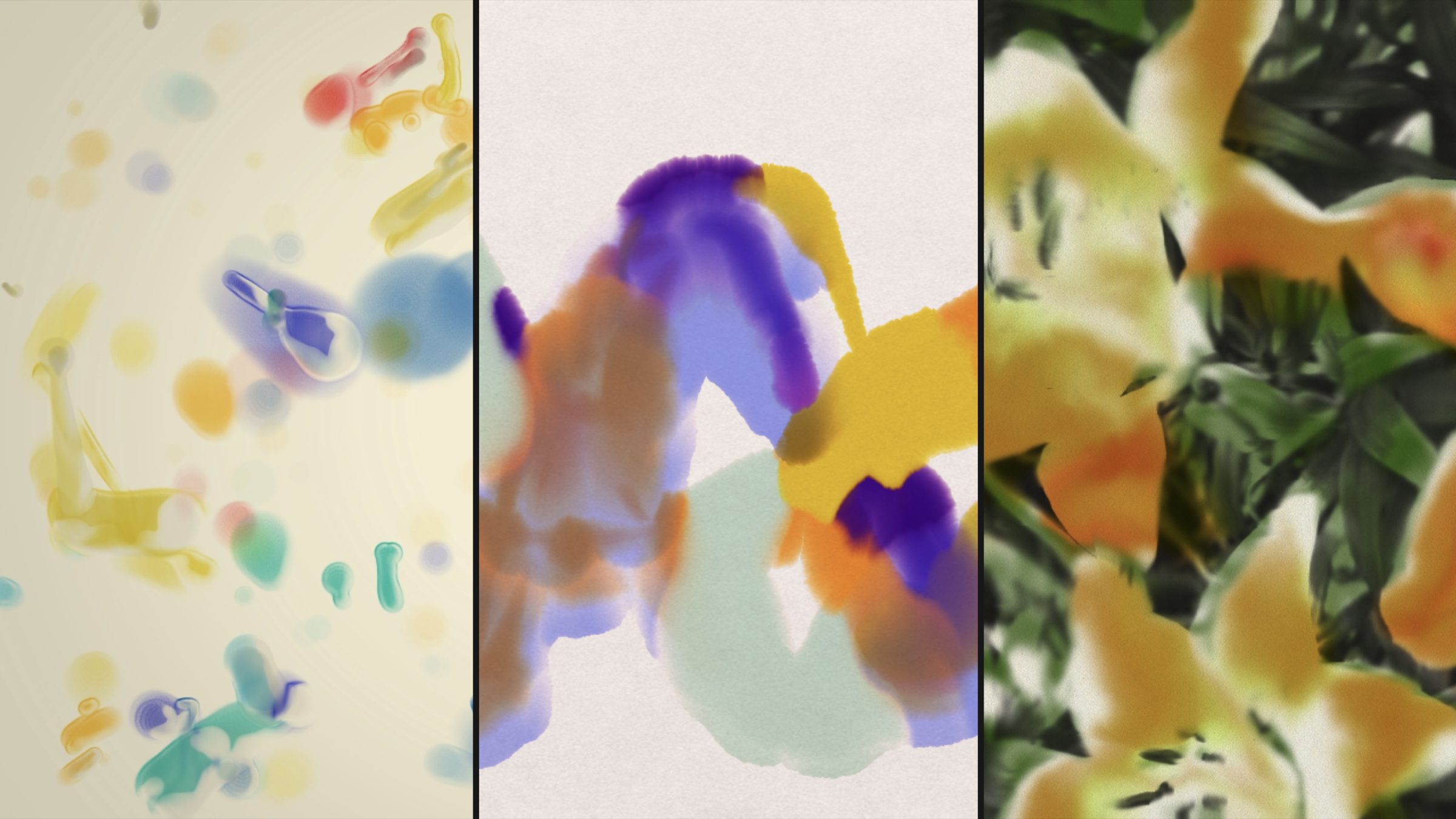
That’s it. Try exploring your own approaches based on the ideas we see here. Below are some more examples made using the techniques we’ve covered on this page combined together.
以上です。ここで見たアイデアに基づいて、独自のアプローチを試して見ましょう。以下は、このページで紹介したテクニックを組み合わせて作ったものの例です。